Assignment Word Count 5458 – Journal Entries 4485 (excl ref and figures)
The Royal National Lifeboat Institute saves hundreds of lives each year (RNLI, 2023). This assignment showcases how brand collaboration and digital design can facilitate water safety awareness and increase donation support.
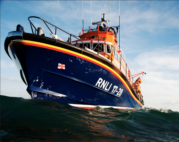
Fig. 1 RNLI Lifeboat - (RNLI, 2023)
1.0 Introduction
This assignment develops the design process in practical and theoretical terms through a collaborative proposal, conceptual framework and individually designed outcome. The project aim is to produce a mobile digital application that will integrate into the Royal National Lifeboat Institute (RNLI) organisation to provide coastline water safety information in the public domain. The app design will incorporate The Five Elements of UX Design (Garrett, 2002) through the strategy, scope, structure, skeleton and surface framework. The assignment will also focus on Sustainable Development Goal 17 – Partnership for the Goals (United Nations, 2023) in the provision of digital design products and services that revitalise sustainable and collaborative development.
The project is a reflective study and integrates Kolb’s Reflective Learning Cycle (1984) of planning, doing, reflection and conceptualisation with the purpose to gain insights and conclusions throughout the process. This will draw upon the experiences gathered from design practice and personal journal entries. The journal entry for the project ideation may be viewed here:https://designerdigital.uk/design-practice-project-ideation/The following three sections outline the RNLI charity with a background (1.1) SWOT analysis (1.2) and rationale (1.3) to provide a business case for app development.
1.1 Background
The RNLI is a charitable organisation that has saved lives at sea for almost 200 years. They are independent of government but have a working relationship with HM Coastguard, who provide UK Search and Rescue. The RNLI service and maintain 238 lifeboat stations on 242 popular beaches and campaign for water safety awareness. The service is almost completely funded by public donation through television advertising and fund raising events with only six percent coming from trading and investments. Each crew member costs almost £5000 in kit and training. In 2022, they rescued 45 people each day, indicating a need for sustainable and consistent awareness to ensure continuing financial support (RNLI, 2023). The need for safety information is likely to increase as The Water Sports Participation Survey (The Nursery Research and Planning, 2022) revealed that from October 2020 – September 2021, the amount of water sport participants doubled in the UK. The next section analyses the strengths, weaknesses, opportunities and threats of the RNLI.
1.2 SWOT Analysis
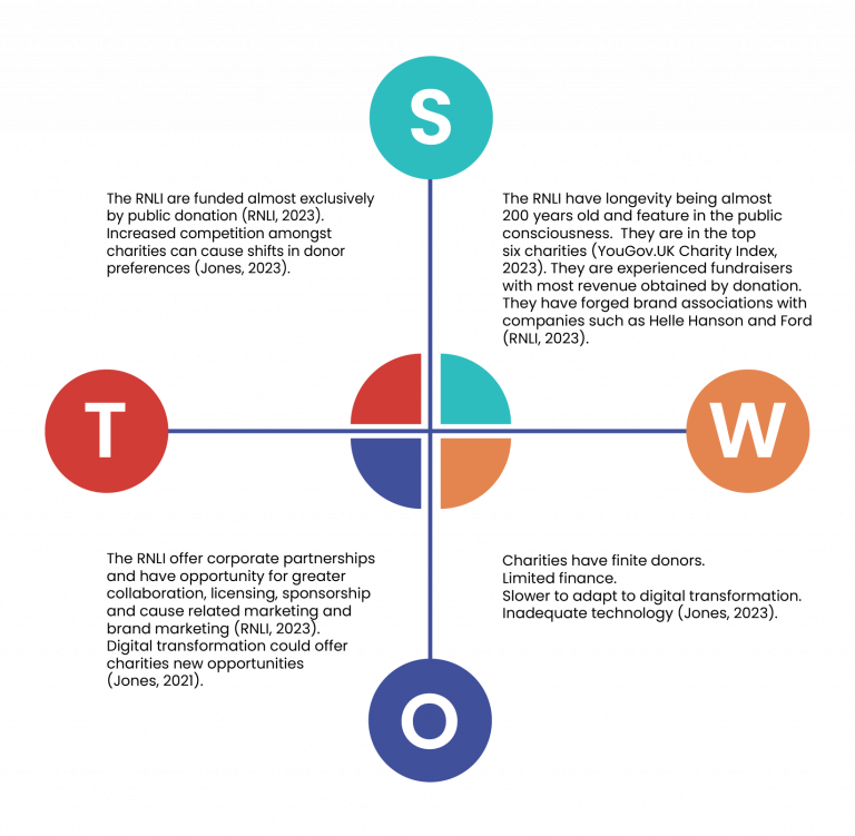
A SWOT analysis (Fig.2) has been compiled to ascertain the strengths, weaknesses, opportunities and threats of the RNLI in regard to the public facing side of the organisation. It provides focus on how the strengths can be leveraged on new opportunities and how weaknesses can magnify organisational threats (Helms & Nixon, 2010).
Fig. 2 - SWOT Analysis (Heugh, 2023)
1.3 Rationale
The rationale for mobile application development is reflected by a set of factors:
Increasing competition for donations – The RNLI is funded entirely by donation and therefore financial limitations. There is also increased competition due to shifts in donor preference especially in times of economic pressure. See Threats and Weaknesses (Jones, 2021). Mobile app development would increase user value and convenience especially if they are first to market to offer coastal water safety (See market gap below).
Maintain and expand awareness and relevance – The advent of digital transformation forces business to adopt and develop or face obsolescence. Charities through their limited finance are often slow to pursue innovation. See Weaknesses (Jones, 2021). In order for the charity to maintain and expand their awareness they need to adopt digital advantage, through a growth medium. Mobile applications are expected to grow by 14.4% Compound Annual Growth rate in the next nine years from 208.5bn to 777.4 bn, which would provide a suitable digital platform (Apoorv et al., 2023).
Market gap – There were no identified water safety apps in the search results on app stores providing an opportunity to feature RNLI safety information, gaining early adopter advantage. The RNLI can utilise their strengths of awareness and longevity in the public consciousness to promote trust and foster potential collaborations to fund and partner businesses in app co-creation. See Strengths and Opportunities (RNLI, 2023).
The next section (2.0) appraises the water safety app market for nearest competitors.
2.0 Competitor Research
Competitor research was scant in this assignment as no other water safety apps were found. However two personal safety apps were assessed for their value proposition as a guide for the assignment. The next section (2.1) looks at their assessment.
2.1 Mobile App Assessment
An initial search was carried out on Google Play App Store for ‘water safety apps’. The main search results returned apps for:
Water drink reminder
Water eject tool
Check water resistant qualities
Safer Seas and Rivers Service – which tackled the issue of water sewage.
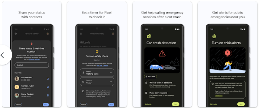
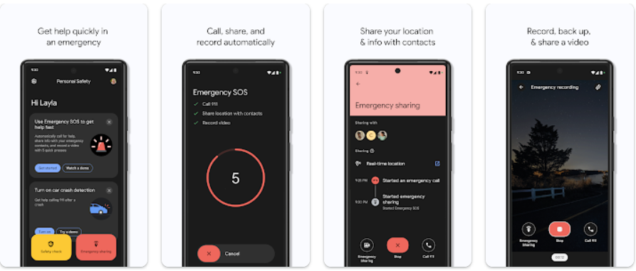
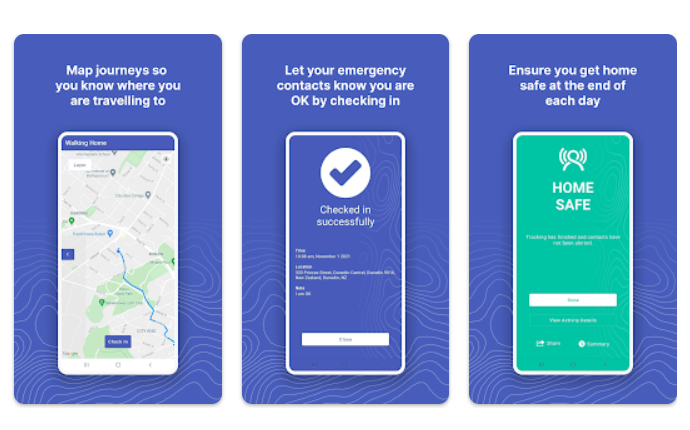
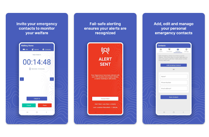
As this enquiry rendered no viable results a further search was executed for ‘safety apps’, which returned a better outcome, although these did not contain water safety. The subject outcomes focused mainly on personal safety when out and about and what to do in accidents. Two of these apps were selected for further analysis: Personal Safety (Fig.3) and Get Home Safe (Fig.4).
Fig.3 - Personal Safety App - Google Play (2023)
The Personal Safety app has an overall look and feel of a serious interface indicated by the black background with primary coloured hilights of yellow, blue and red and sans serif font. Features include emergency SOS, emergency sharing and car crash detection. The review rating is 3.6 stars from 26.5k reviews.
Fig.4 Get Home Safe – Google Play (2023)
The Get Home Safe App also employs primary colours (in RGB mode green is a primary hue) but still portrays a serious visual display and sans serif font. It also provides alerts and emergency contacts but has a map display, which is useful for area knowledge. The review rating is 3.9 stars from 85 views.
2.2 Mobile App Assessment Summary
It can be seen from these examples that primary colours are used, which command attention and sans serif fonts that are clear to read. There is a stark user interface in both apps, however the clean interface allows the message of each screen to be clear and unambiguous. The reviews were both under 4 stars with consumer comments revealing frustrations with technical issues, unclear wording and excessive clicks to access screens, however users did find these apps a positive idea. The lack of water safety apps shows that the RNLI could corner a niche market, which could allow a greater awareness regarding water safety in an easy to use digital format that could drive traffic to their website and social media. The journal entry may be viewed here: https://designerdigital.uk/design-practice-competitor-analysis/ The next section looks at the collaborative aspects of the assignment brief.
3.0 Collaboration
The Sustainable Development Goal (SDG) 17 for Partnerships (UN, 2023) is an essential consideration of the project and is viewed from the level of the organisation and brand partnership (3.1), the wider community (3.2) and that of the designer and client (3.3).
3.1 Brand Partnership
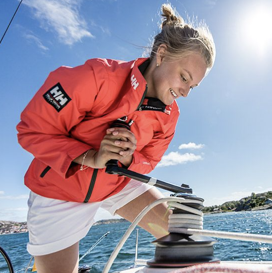
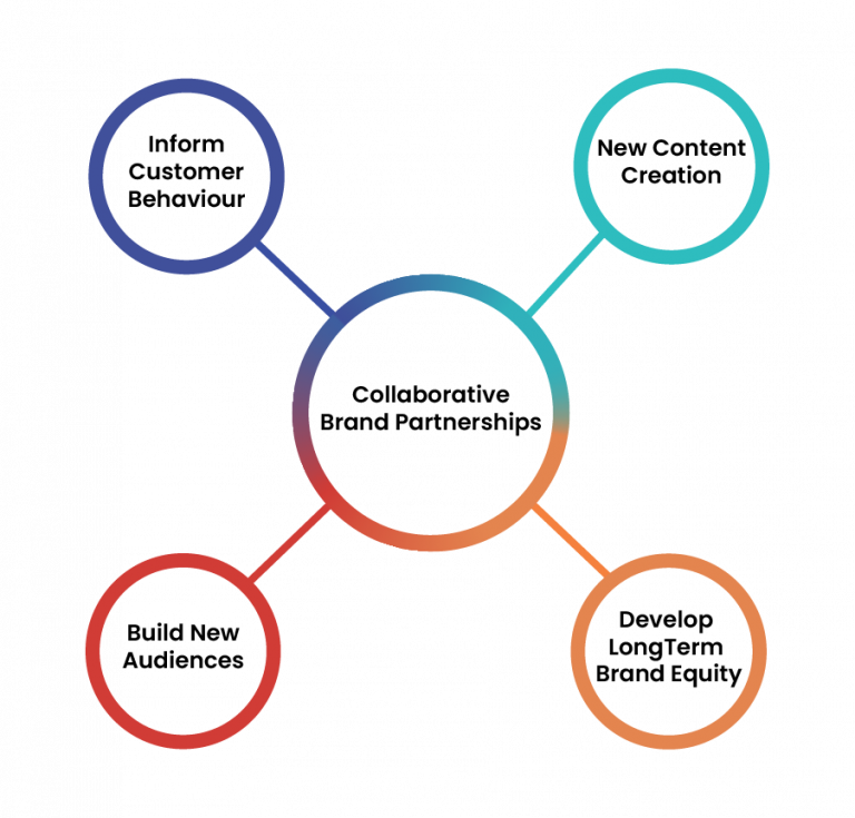
The SDG 17 for Partnerships (UN, 2023) are “a lever for securing global transformation toward socioeconomic and environmental sustainability”. They stimulate public, private and third sector actors to facilitate partnerships and networks (Ansell et al., 2022, p.1). Co-creation through shared knowledge, resources and governance capabilities can benefit common goals and spark innovation, which benefit public, private and civil society, whilst preserving precious resources. Brand partnerships can also benefit social causes by providing credibility and a spotlight on charitable foundations in the phenomenon of cause related marketing (Yun et al., 2019). Collaborations can also lead to new content, inform customer behaviour, build new audiences and develop long term brand equity (WARC, 2023) (Fig.6). In this scenario the RNLI will partner with Norwegian work wear brand Helle Hanson (Fig. 5) (Availableat: https://www.hellyhansen.com/) to showcase a potential collaboration through a sponsored mobile app.
The proposed digital app can also aid in coastal rejuvenation, by providing local knowledge for included areas and through the sharing of user images on social media. Travel images posted to social media can influence the way destinations are seen, experienced and remembered (Iglesias-Sanchez et al., 2020) and thus empower visitors through user generated content. This of course can be positive and negative, but a safe beach can attract more tourists and generate business. A survey by Dodds and Holmer (2018) found that residents of coastal destinations were more likely concerned about environmental issues whilst visitors are likely to support blue flag beaches, suggesting that tourism is likely to increase if a beach has safety information.
3.3 Designer and Client
The relationship between the designer and client is forged at the proposal and briefing stages. Contemporary designer Chris Do (The Futur, 2014) suggests establishing the terms of engagement during the first client meeting. This underlines the position in the relationship and expected role – for example, is the designer a facilitator for the design brief, a strategic thinker to expand ideas or someone to follow orders and what part will end users play? (Video available at: Establish The Terms of Engagement During First Client Meeting (youtube.com)). The end user however is typically viewed as providing input and feedback (Phillips, 2004) with varying involvement in the design process. Taffe (2015) depicts the differences in these relationships in three scenarios – designing for the end user where they are designed for; user-centred design where input is required towards the end of the project; and co-design when companies actively involve stakeholders to participate in design process and innovation. Co-design has become popular with brands such as P&G, BMW, 3M and Xerox since the start of the Millenium (Bilgram et al., 2011) but may not be suitable for some smaller companies due to management of stakeholder groups and agency cost, although it may be scaled proportionately. This project will assume a co-design process with the client and a user centred design involvement for the end user, which will involve user feedback at the end of the process. The journal entry may be viewed here: https://designerdigital.uk/relationships/
3.4 The Creative Brief
The creative brief for the assignment may be found here:
This section incorporates The Five Elements of UX Design proposed by Garrett (2002) as the process model. The five elements consist of strategy, scope, structure, skeleton and surface. This model was selected for the strategy foundation rather than Plattner’s Five Stages of Design Thinking (Dam, 2023) which consist of empathise, define, ideate, prototype and test. Whilst there are similarities in design models, the emphasis is directed by the strategy requirements of the RNLI organisation whereas Plattner’s model understands the user requirement first and the problem second. The next section (3.1) outlines the strategy.
4.1 Strategy
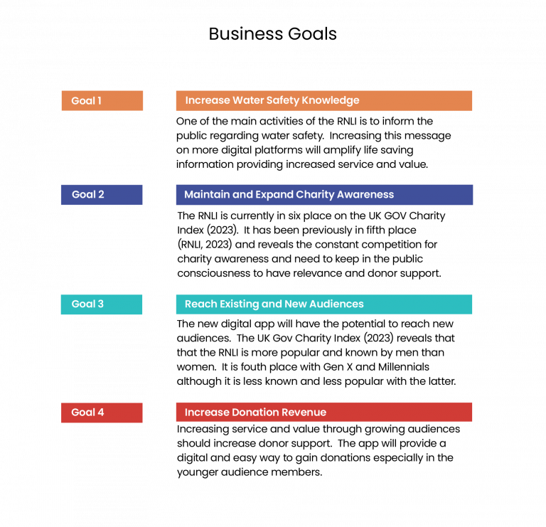
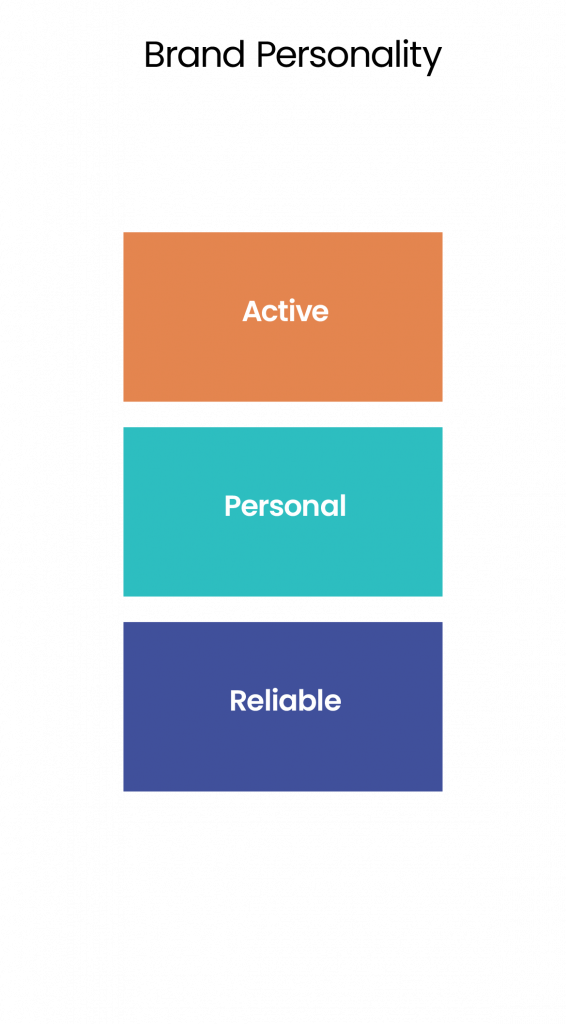
The first element is strategy, which is established by the business goals of the charity, derived from the research in section (1.0) and summarised in (Fig. 7). The current brand personality of the RNLI is stated as active, personal and reliable (Fig. 8) and this will be considered in the design and content of the app that it aligns with the brand. In this project the business goals are focused on the RNLI and not of Helle Hanson, the brand sponsor, although the benefits are discussed in section (2.1).
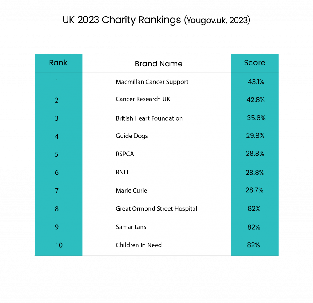
The charities in the UK are ranked by their performance according to their donor ranking score (Fig. 9). This is based on data collected by members of the public. The methodology is not displayed on the Yougov.com website, however this has been taken as a representation of the popularity and preference amongst UK donors and shows the RNLI in sixth position.
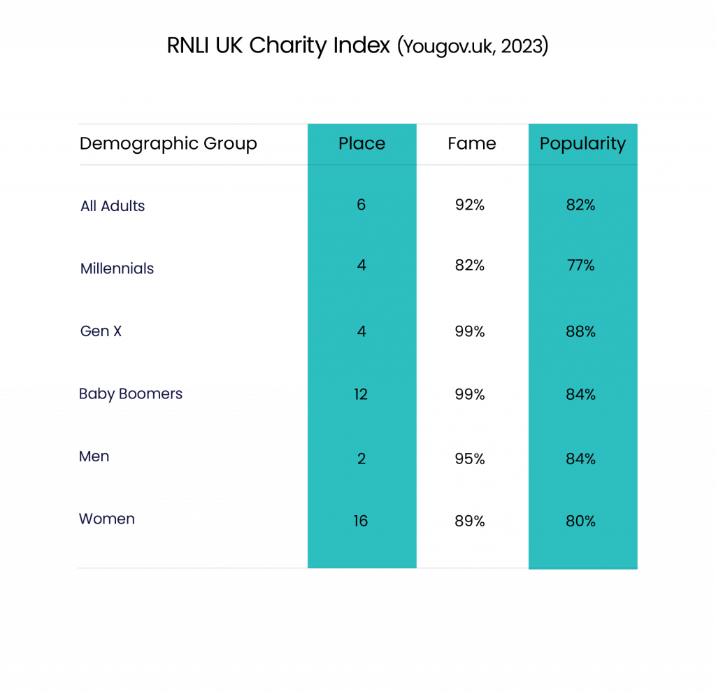
The target audience that the RNLI most resonates is with the male demographic. The UK Charity Index Chart (Yougov.uk, 2023) measures the charities that the population would most likely donate towards. The chart (Fig. 10) has segmented this popularity through age and gender, although not both together. The RNLI rank second place with men who have a 95% awareness of the charity and a 84% popularity rating. The Millennials and Gen X categories are in fourth place with the RNLI being the most well known and popular charity amongst the Gen X category. The RNLI feature less significantly for women where they rank sixteenth and have 89% awareness and 80% popularity, indicating a opportunity for growth.
Fig. 10 - RNLI UK Charity Index - YouGov (2023)
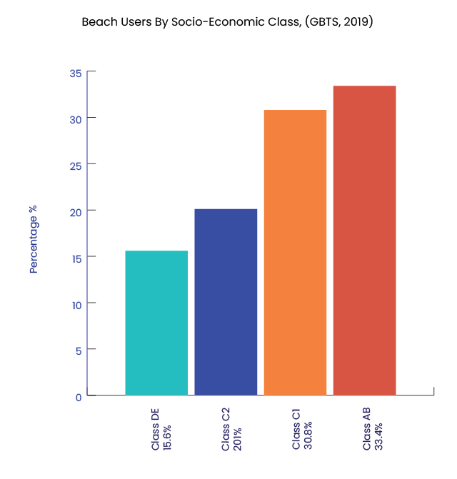
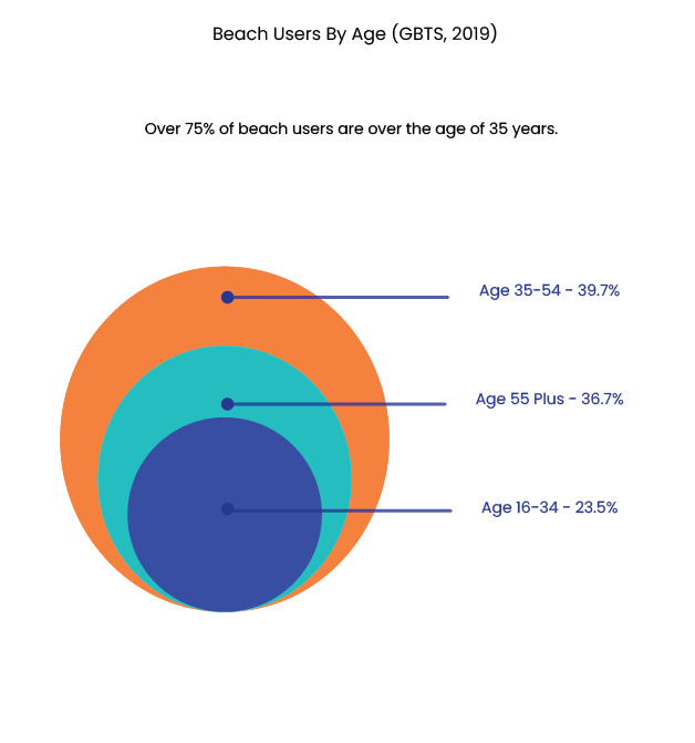
The following charts consider the demographics of beach users by socio-economic class (Fig. 11) and age (Fig.12). The chart (Fig. 11 ) shows that Class AB and Class C1 visit the beach the most. These groups account for all levels of professional, administrative and managerial workers. The age of beach users are predominantly over 35 years of age (Fig.12). The largest group that visit the beach are families that account for 41% of the visitor share (Coastal Tourism Academy, 2023). Please view journal entry here:https://designerdigital.uk/design-practice-communication/
Fig.11 - Socio-economic Class of Beach Users (GBTS, 2019) - Image Heugh (2023)
Fig.12 - Beach Users by Age (GBTS, 2019) - Image - Heugh (2023)
4.1.3 Target Audience Personas
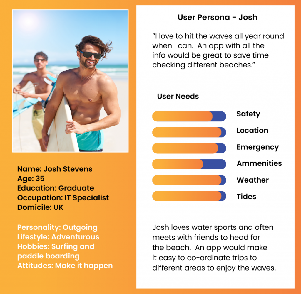
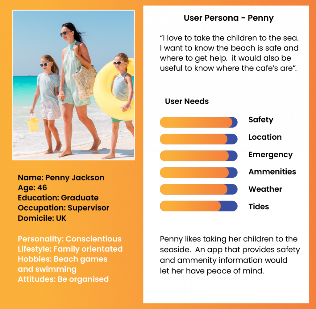
The RNLI have a large audience in the male demographic. It is also noted that higher income groups over the age of 35 are more likely to frequent the coast as well as those with families. The research in section (1) also indicates a rise in water sport activities. In order to attract new audiences the male millennial and female demographic groups will be targeted for the app, which are reflected in the personas (Figs. 13 & 14) who find find value from the water safety information and whom are more likely to donate online to good causes (Hoss, 2021).
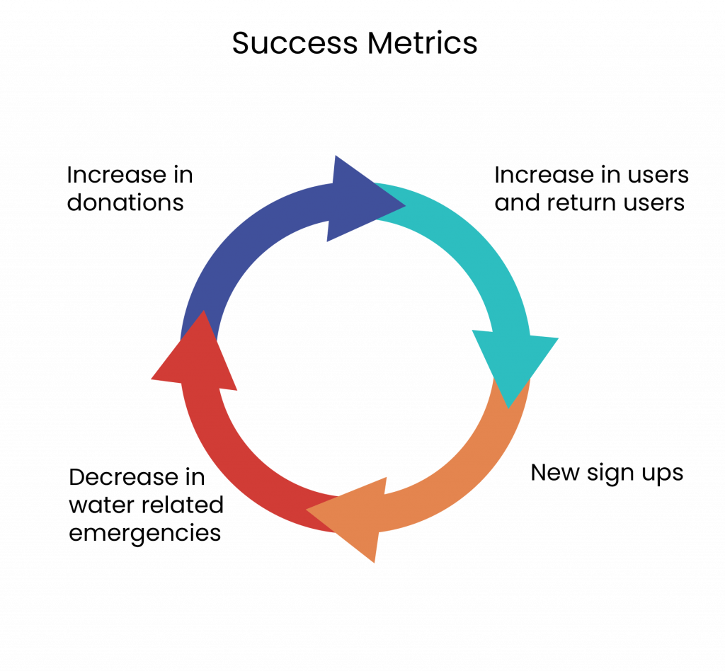
The strategy can be determined by success metrics (Fig.15). These are quantifiable measurements that allow business leaders to track that the strategy is having the desired result (Laoyan, 2022). In this scenario, this may be tracked by the increase in users and return users by set time period, the rate of new sign ups, an increase in financial donations and a reduction in water related emergencies due to the increased spread of knowledge and awareness.
4.2 Scope
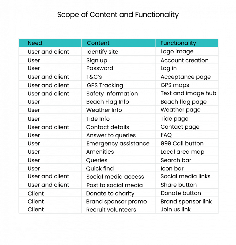
Project scope is the process of defining a project outline that renders it for viability, defining its boundaries and expectations among stakeholders Fageha & Aibinu (2013). Time frames, budget restrictions and developer skill levels can be ascertained by a carefully crafted scope and will be discussed in a later section. The scope can also determine whether the user and client needs are met through the content and functionality requirements (Garrett, 2002), formulated in the strategy section (3.1). The scope compels the developer to address conflicts or potential problems whilst the app is still hypothetical and crystallises definite inclusions and exclusions of content and functionality. It also becomes a blueprint for the project and aids in the prevention of scope creep. In the chart (Fig.16) below, the user and client needs are matched to corresponding app functionality. Some joint needs are defined such as including social media links and posting facility. This not only provides an extra functionality for the user but aids in building awareness for the RNLI (section 1.4) and thus are mutually beneficial. The next section looks at the design structure.
Fig 16 - Scope of Content and Functionality - Heugh (2023)
4.3 Structure
The structure is where the design moves from ideation to a more defined arrangement that will determine the end user experience. Information architecture consists of two components: 1. The structural component, which organises content into categories, hierarchies and relationships and 2. The labelling component, which are the terms that define them (Hannah, 2023). The next section (4.3.1) looks at the sitemap for the Watersafe app revealing the structural component, hierarchy and relationships. The journal entry may be viewed here:https://designerdigital.uk/design-practice-information-architecture/
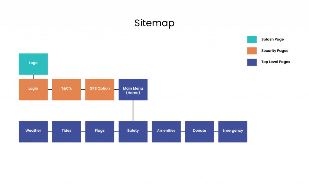
4.3.1 Sitemap
In the sitemap below (Fig. 17), it can be viewed that the information is hierarchical and lateral. In order to enter the app, the user has to log in and perform a sequence of steps to arrive at the main menu. The main menu is hierarchical to the information pages, which are lateral to each other. This allows the user to view the pages without having to go deeper into the app. This breadth gives the user a higher number of options, which saves the user time and avoids frustration in finding information. The emergency call button is also on a top level page. Even though emergencies do not tend to happen on a frequent basis, it would be difficult to locate it under several layers of hierarchy in times of need and stress, hence it is positioned last in the main menu. The structure also allows later upgrades to the site. The safety page could expand into more layers if it should be required, however the app is designed primarily for quick access information and is not styled as an in depth resource for long term survival. This layout aligns with Fitt’s Law (Laws of UX, 2023) who states that the user needs to accomplish a task with the least minimal effort, a concern mentioned in Section 2.2.
Fig. 17 - Sitemap (Heugh, 2023)
4.3.2 Labelling
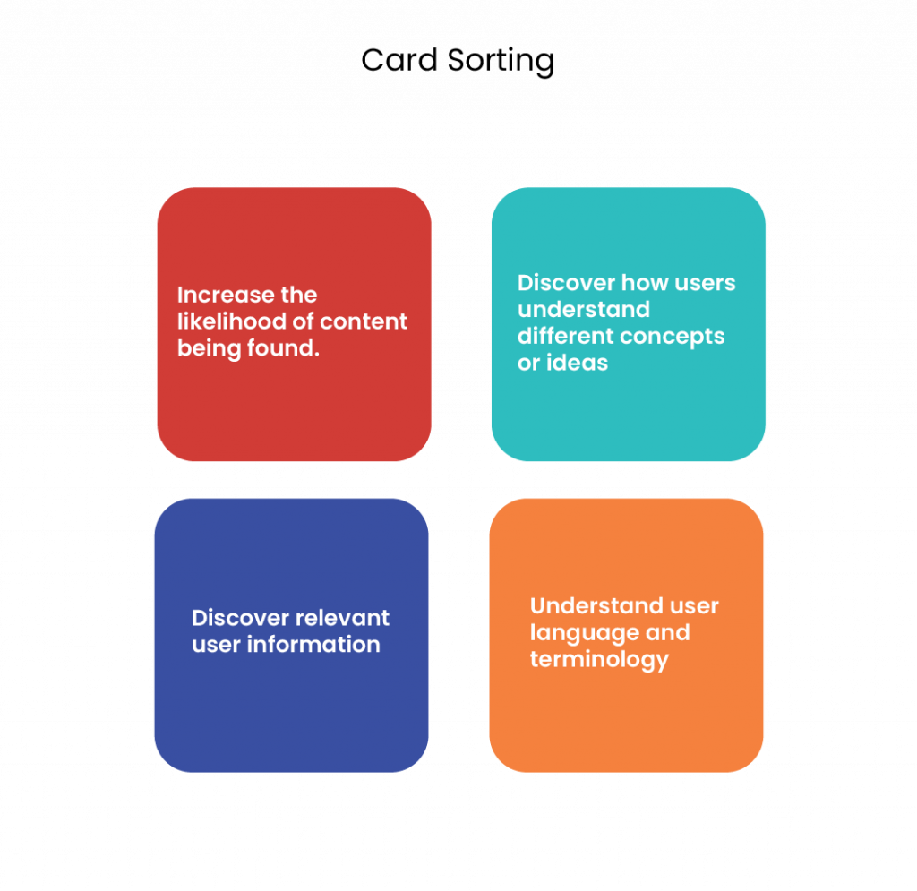
Labelling is how the categories are termed and should align with the language of the target audience to enable immediate familiarity and understanding. One way of testing this is through card sorting, a qualitative research method that may be used to group, label and describe content based on user feedback. Card sorting can enable the designer to increase the likelihood of content being found; discover how users understand concepts and ideas; identify user language and teminology and discover user information (Carr, 2023) (Fig. 18).
A card sorting exercise was carried out for the assignment and is available here:
It was discovered that an open sort (where users could assign categories) proved too diverse. A further closed sort (where categories were assigned) was carried out and proved to be more productive. This suggests that designer intervention is useful in guiding user direction when too much diversity occurs.
Fig. 18 - Card Sorting Benefits, Based on Carr (2023) - Image (Heugh, 2023).
4.4 Skeleton
The previous section concentrated on how the app will work on larger scale issues of architecture and interaction. In this plane the functionality and a more refined level of detail is considered and spans across interface, navigation and information design (Garrett, 2002). This is often depicted through wireframes in various stages of detail. The initial stage, a low fidelity wireframe has been contructed on paper and is available here: https://designerdigital.uk/design-practice-wireframes/
According to Soegaard (2023) wireframes have a specific role in user experience (UX) design: to explore initial ideas; collect feedback; plan functionality; structure content; map the customer journey and as an aid in usability testing. In application, it is worth remembering UX laws such as Fitt’s Law (Laws of UX, 2023) in the sitemap example (Section 4.3.1). Hick’s Law (Laws of UX, 2023) suggested that stimuli or reduced choice, should be kept to a minimum for faster user response and Miller’s Law (Laws of UX, 2023) who proposed that immediate memory and absolute judgement was confined to seven pieces of information at once. and thus chunking information was optimal. It can be viewed in the Figma wireframe (Figs. 19 – 30) that the menu items have been kept to seven to avoid overwhelm and allow the user to make a clear selection with the information being arranged in no more than four card groups to chunk information together. Although these laws are for guidance, the designer should be aware of the amount of information or steps that a user must process in order to keep interest. This was taken into consideration when planning the design layout by including such as clickable buttons, drop down boxes to sort information, calender pickers to select date information and arrows to direct clear way finding. Some considerations for conscious design were a journal entry that may be viewed here: https://designerdigital.uk/design-practice-conscious-design/ The mid fidelity wireframe constructed on Figma (Figs. 19 – 30) are shown below. The next section looks at the surface plane.
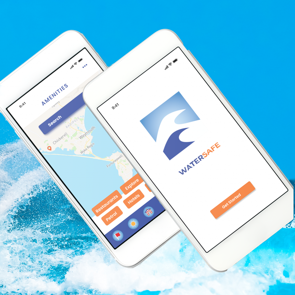
Fig 19. Logo -Heugh (2023)
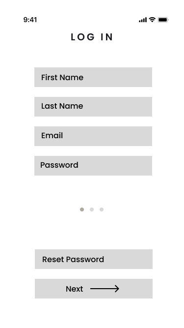
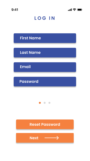
Fig 20. Log In - Heugh (2023)
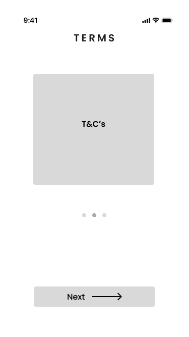
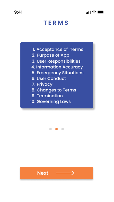
Fig 21. Terms - Heugh (2023)
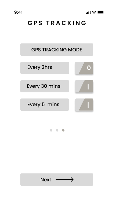
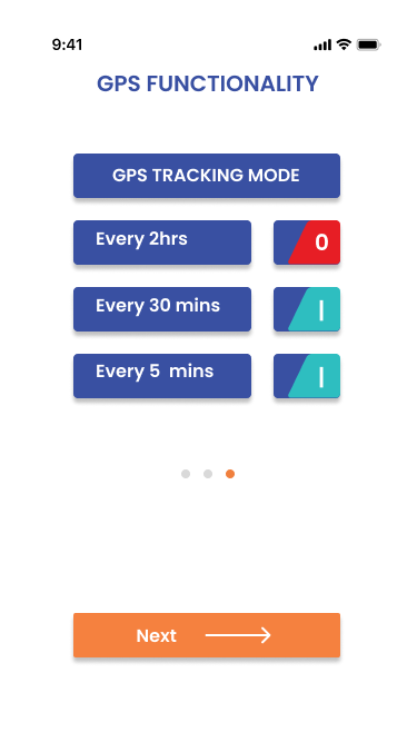
Fig 22. GPS Tracking - Heugh (2023)
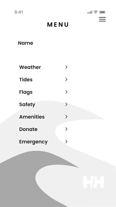
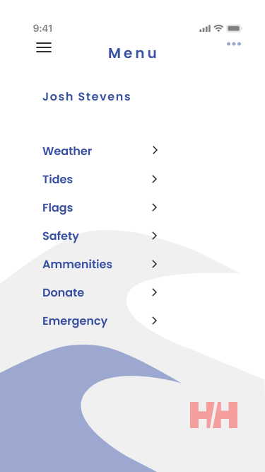
Fig 23. Menu - Heugh (2023)
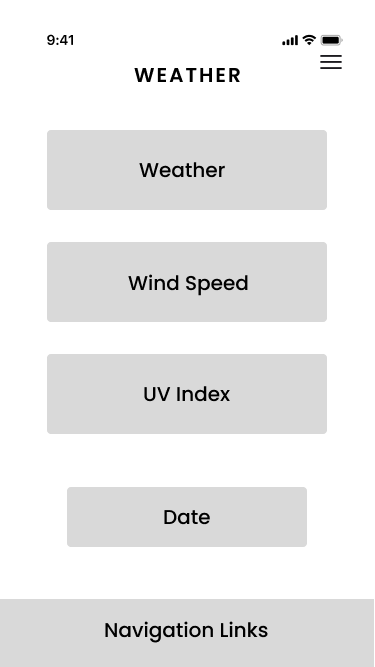
Fig 24. Weather - Heugh (2023)
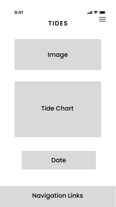
Fig 25. Tides - Heugh (2023)
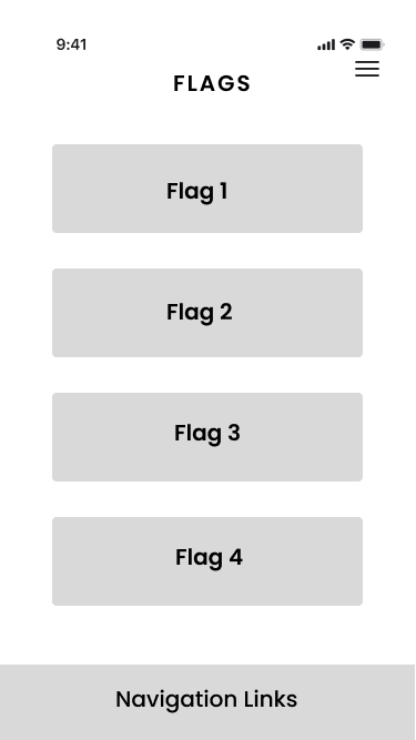
Fig 26. Flags - Heugh (2023)
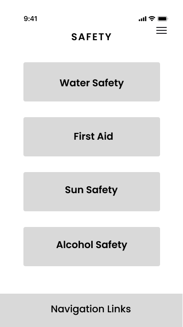
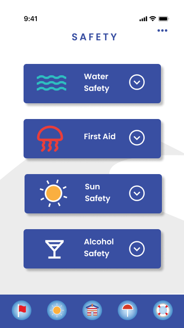
Fig 27. Safety - Heugh (2023)
Fig 28. Amenities - Heugh (2023)
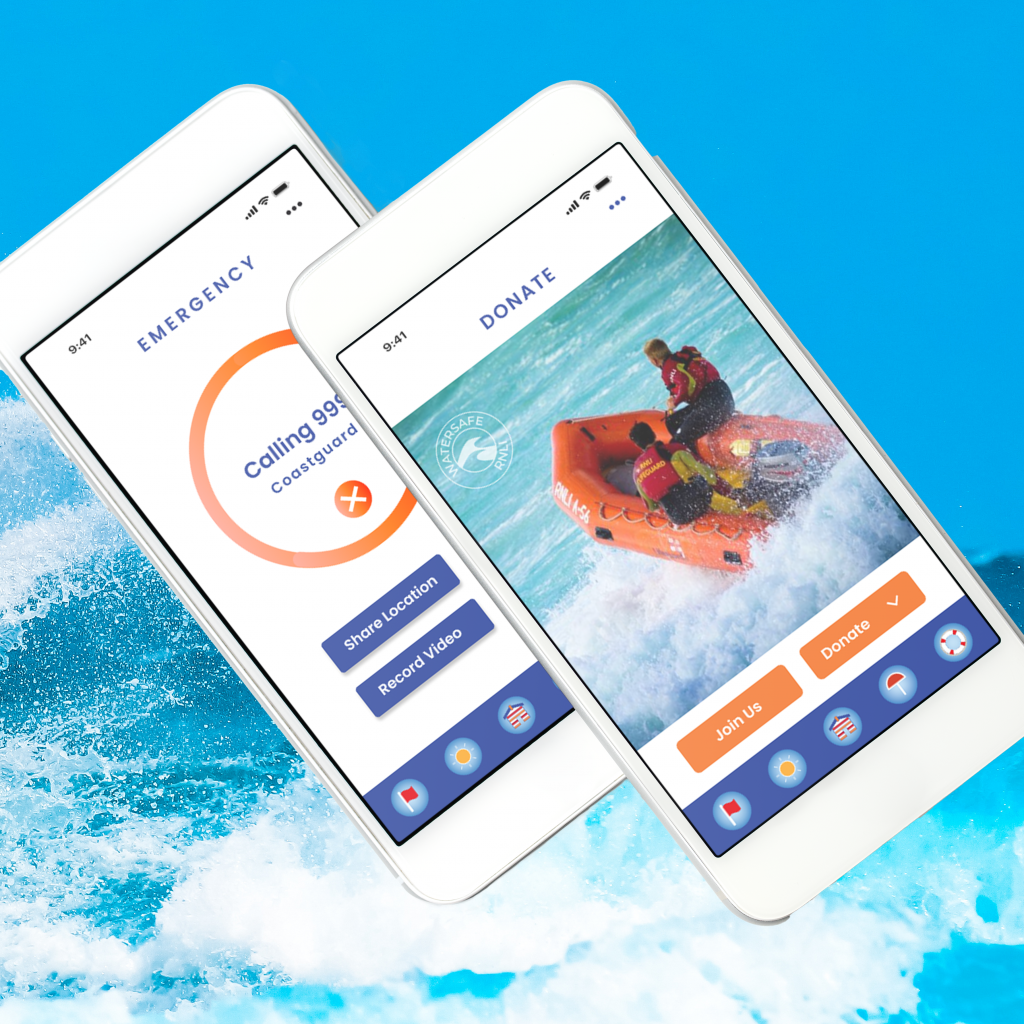
Fig 29. Donate - Heugh (2023)
Fig 30. Emergency - Heugh (2023)
4.5 Surface
The surface plane is concerned with the visual and aesthetic aspects of the design and is displayed in a final mock up and working prototype. Garrett (2002) suggests that the internal and external consistency should be in harmony, meaning that the different parts of the design should compliment other products of the organisation. However, with this design having a collaborator, the design must also align with the sponsor, making this an extra consideration. This has been achieved with echoing the grey background and splashes of colour from the Helle Hanson website : https://www.hellyhansen.com/en_gb/ Although the app aims to connect with new audiences, the RNLI brand message is active, personal and reliable (section 4.1.1) and this has been carried through by the active feel of the logo and wordmark and the colour palette that blends with the RNLI. It is also more personal than the starkness of the sites researched in the competitor analysis (Section 2) giving a more personable feel to the product. The reliability is portrayed by the information and lack of gimmicks, making this a site to rely on. The journal entry for visual identity may be viewed here:https://designerdigital.uk/design-practice-visual-identity/ The next section looks at the formation of the brand elements in more detail.
4.5.1 Mood Board
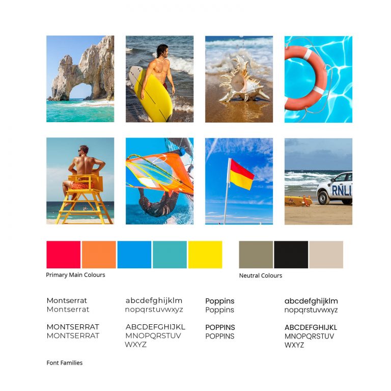
The creation of a mood board (Fig. 31) not only displays inspirations but takes an active role in finding and solving problems in the design process (Ormecioglu & Ucar, 2015). It helps set the scene for the visual identity of the app and asks how literal the design elements should reflect real life. The RNLI brand message is active, personal and reliable (section 4.1.1) and provide a reliable but dangerous service and hence realism should be maintained but without scaring off potential users. The visual elements are both denotative and connotative as argued by Barthes (2007) where symbolism is both literal and connotative such as a flag, which is a literal symbol of attention with its colours symbolising a connotative meaning such as red meaning warning or danger. The colour palette also reflected the associated colours of the sea, life aids and flags and was used as a baseline, as the palette progressed to darker blues to create contrast through the iterative process. The typography selected was sans serif Montserrat and Poppins, which are clear and easy to read for information based apps.
Fig 31. Mood Board - Heugh (2023)
4.5.2 Logo Design
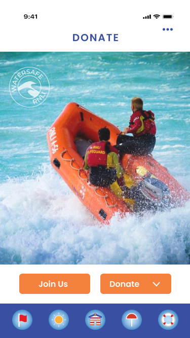
The logo represents the brand essence. According to Sagi Haviv (2019) a logo should be appropriate, distinctive and simple. The project logo (Fig.33) is appropriate in that it reflects the brand message of activity, with moving waves against a backdrop of sky symbolising the continual momentum of the sea and the Gestalt principle of continuity of following a path (Interaction Design Foundation (2023). The shape of the waves are distinctive and are easily identifiable and a simple design that may be scaled for different branding requirements. It was designed in Adobe Illustrator with the pen tool on a 1024 x 1024 pixel grid (Fig.32) that aligns with Apple icon guidelines; available at: https://developer.apple.com/design/human-interface-guidelines/app-icons. Movement is also depicted in the Watersafe word mark (Fig. 35) where the interior of the word Watersafe has been warped in a wave pattern again following the Gestalt principle of continuity and adding repetition. The word ‘water’ is literal in its colour of blue and the word ‘safe’ is orange with the connotatation of symbolising confidence, optimism even boldness (Cherry, 2023) suggesting personal confidence in the water. There are black and white versions of the word mark (Fig.35) and a round logo version (Figs. 36 & 37), which may be used when the full colour version is not suitable for the branding. The white round logo may be used as a watermark as in the RNLI image of the app donation page (Fig.53). The navigation icon bar uses symbolism in a literal and connotative form; flags for attention; the sun for the weather; the beach hut for home; the parasol for safety protection and the life ring for emergency. These were made in Adobe Illustrator on smaller grids and are used for quick link icons to the relevant app pages.
Fig 32. Icon Grid - Heugh (2023)
Fig 33. Watersafe Logo - Heugh (2023)
Fig 34. Navigation Icon Bar - Heugh (2023)
Fig 35. Watersafe Word Mark - Heugh (2023)
Fig 36. Watersafe Round Logo White - Heugh (2023)
Fig. 37 Watersafe Round Logo Black - Heugh (2023)
Fig 38. Watersafe Wordmark White - Heugh (2023)
Fig.39. Watersafe Wordmark Black - Heugh (2023)
4.5.3 Brand Sponsor Elements
The project features the brand collaboration with Helle Hanson and it was considered how to blend this in with the brand styling. Helle Hanson features a grey background with colour hilights on its website (Section 4.5) and this was brought into the design for the main menu background page, using the watersafe log in grey and blue with their characteristic red logo (Fig.40. The on/off buttons were also styled in reference to the logo as a nod to the brand sponsorship (Figs. 41 & 42).
Fig 40. Helle Hanson Logo (HelleHanson.com)
Fig 41. Off Switch - Heugh (2023)
Fig 42. On Switch - Heugh (2023)
4.5.4 Visual Design Layout
Fig 43. Splash - Heugh (2023)
Fig 44. Login - Heugh (2023)
Fig 45. Terms - Heugh (2023)
Fig 46. GPS - Heugh (2023)
The app introduces the splash page (Fig. 43) and the security pages in a clear and logical sequence (Figs. 44, 45 & 46). The orange buttons are only kept to the footer of the app to keep consistency with a call to action regarding page direction. The three progress dots on the pages inform the user how many pages they have to get into the app.
Fig 47. Menu - Heugh (2023)
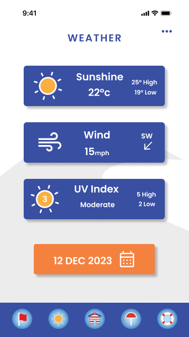
Fig 48. Weather - Heugh (2023)
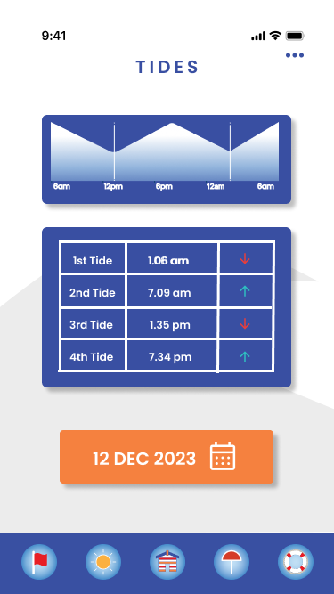
Fig. 49. Tides - Heugh (2023)
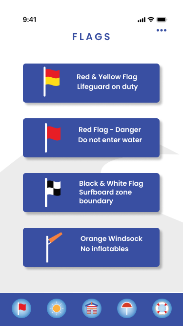
Fig 50. Flags - Heugh (2023)
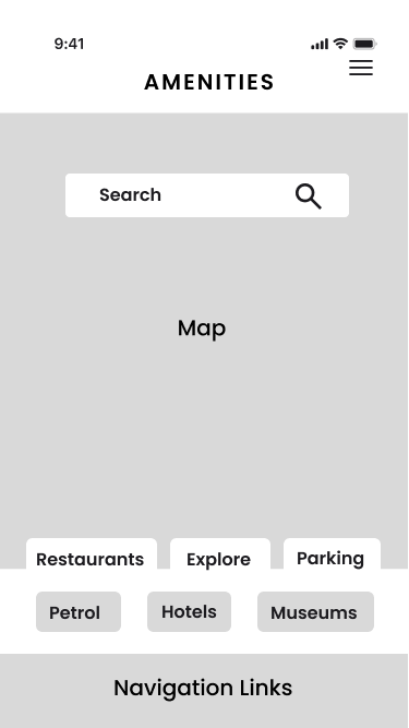
The main menu page (Fig.47) is shown here when the fly over is completed. It personalises the app by adding the users name to align with RNLI brand messaging. The menu list contains seven pages to avoid over complication. The ‘more’ button (three dots) will link to other information not displayed visually on the app. In a developed app the Helle Hanson logo would be clickable and would link to their website. The next four pages provide user information regarding the weather (Fig. 48), tides (Fig. 49), flags (Fig.50) and safety (Fig.51). They complement visually even though the information requirements vary, which is displayed visually through image and text. The safety page uses a drop down feature to arrange information in easy to select groups, chunking data as mentioned in section 4.4. ‘
Fig 51. Safety - Heugh (2023)
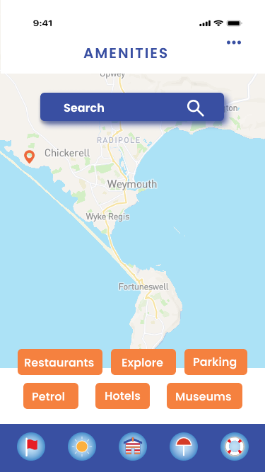
Fig 52. Amenities - Heugh (2023)
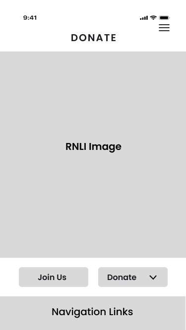
Fig 53. Donate - Heugh (2023)
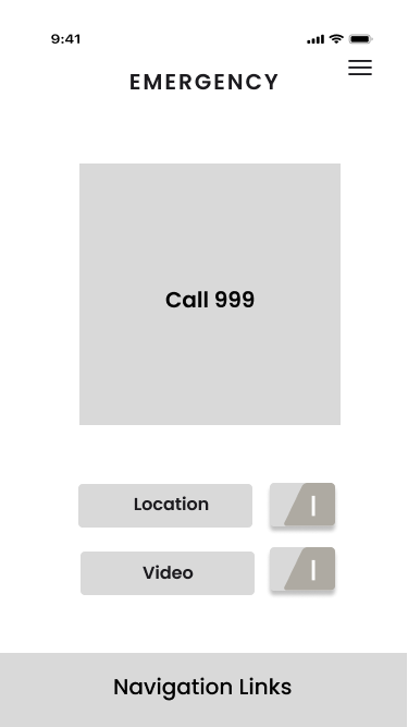
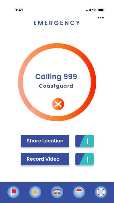
Fig 54. Emergency - Heugh (2023)
The amenities and donate pages (Figs. 51 & 52) were expanded out to use a full width. This is useful in viewing maps so the user can get a clearer viewpoint. Pre suggested tags make searching for things like parking easier and saves time. The image on the donate page was also expanded compared to the paper sketch to enable greater impact. The buttons link to the RNLI to join the organisation and the donate button nudges the user to donate to a good cause. Nudge theory has been proven to benefit charitable organisations by prompting conscious awareness, please view: https://www.cafonline.org/about-us/blog-home/giving-thought/how-giving-works/nudging-the-nation
The emergency page (Fig. 54) has a clear call status with a choice to share and record location.
4.5.5 Figma Prototype and Mock Up
The Figma presentation on the left may be played in full screen mode, check for the arrow buttons on the player. All menu buttons, footer navigation icons and orange next buttons are clickable.
A mock up of the app is featured below (Fig.56).
Fig 55. Figma Prototype – Heugh (2023)
Fig 56. Watersafe App Mock-Ups – Heugh (2023)
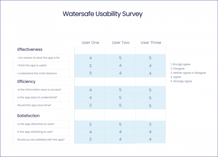
4.5.6 Testing
Testing products is essential to the design process. According to Moran (2019) it is a process to identify problems, uncover opportunities and helps the designer to understand user behaviour. The International Standards Organisation (ISO) defines usability to the extent a product, system or service can be used by specified users to achieve effectiveness, efficiency and satisfaction in a specified context of use (ISO.org – 9241-11:2018). The app was tested by three adults on how effective, efficient and satisfied they would be if they used the app for its intended purpose using a survey consisting of nine questions using a Likert scale (fig. ).
The effectiveness score was 5 x agree | 3 x strongly agree or disagree | 1 x neither agree or disagree
The efficiency score was 6 x strongly agree | 2 x agree | 1 x neither agree or disagree
The satisfaction score was 5 x agree | 1 x strongly agree | 3 x neither agree or disagree
The result was positive with one user commentating that accessing Google may be sufficient for accessing information, however this app is designed for particular users who frequent the beach regularly for a purpose, so it would be beneficial to test this with regular coastal users.
Fig 57. Usability Survey - Heugh (2023)
4.5.7 Style Guide
The style guide for the assignment may be found here:
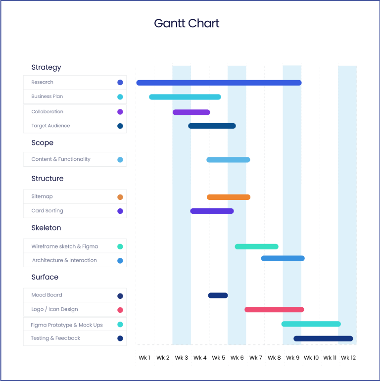
Projects are managed by the influences of social and business factors. Procedural models organise methods and tools into phases or processes and fall into two categories; waterfall and agile. Waterfall project management is plan driven in linear phases and selected where the planning, execution and expected results are clearly defined to the client at project commencement. Agile project management develops solutions in shorter cycles and updates clients at the end of each phase. It is a process where generalised goals cannot be determined until each phase is completed and is indicated for lower level detail, shorter planning and less commitment (Thesing et al. 2021).
In this assignment a waterfall approach was selected determined by the adherence of the linear model The Five Elements of UX Design (Garrett, 2002). However, in a real world scenario, it could be reasonably conceived that logo and creative elements may be subjected to short phases of iteration that can progress after client approval, hence adding an agile element to the creative process.
A Gantt chart (Fig.58) was constructed to show the model phases with the main gate tasks but does not reflect individual planning, reading and learning.
Fig 58. Gantt Chart - Heugh (2023)
6.0 Conclusion
The project had more dimensions to consider due to the collaborative nature of the assignment and including a brand sponsor in the design was challenging. However, it hilighted that collaborations between business and charity can benefit communities as well as the organisations concerned. There is also a scope here to develop a water safety app as one was not identified during the research phase, which may help to prevent the loss of life from water related incidents.
7.0 References
The reference list and bibilography may be found here: