There are various ways in which the testing of user experience (UX) and user interface (UI) layouts in the design process may be undertaken. One of the most basic and easiest is to sketch a wireframe on paper. It helps to get an idea into a visual format to ascertain if it can meet desired expectation. These can include being appropriate for the target audience and how users can navigate and benefit from the application. It can also save resources as the idea can be modified or abandoned in the early stages before further development (Bin Uzayri, 2022). In this project the wireframe was an iterative process and modified several times. This was due to layout revision to enable a better user experience and the exclusion of pages that were superfluous or duplicated similar information. It also provided focus on the features and functionality that was the most important – at least for the first version of this particular app. It was also more challenging as there appeared to be no other app that focused on water safety (See competitor research ) and therefore decisions sometimes had to be made on little comparison.
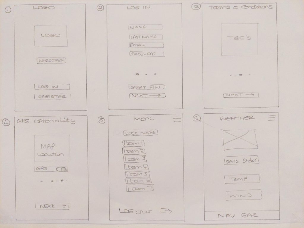
Fig.1 First Iteration Wireframe - Heugh (2023)
Fig. 2 First Wireframe Iteration - Heugh (2023)
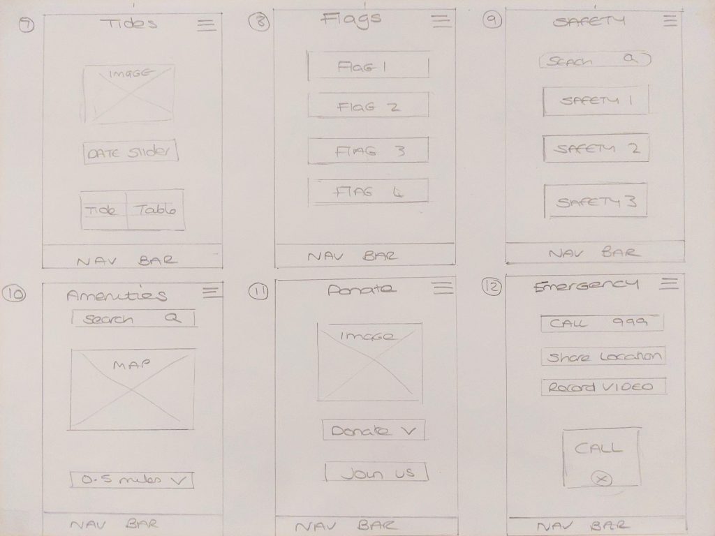
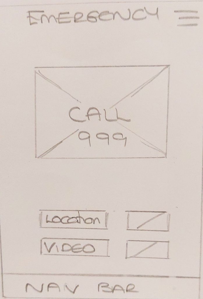
The wireframe was remodelled with Fig.1 and 2 showing the first draft and Fig.3,4,5 showing the final design structure.
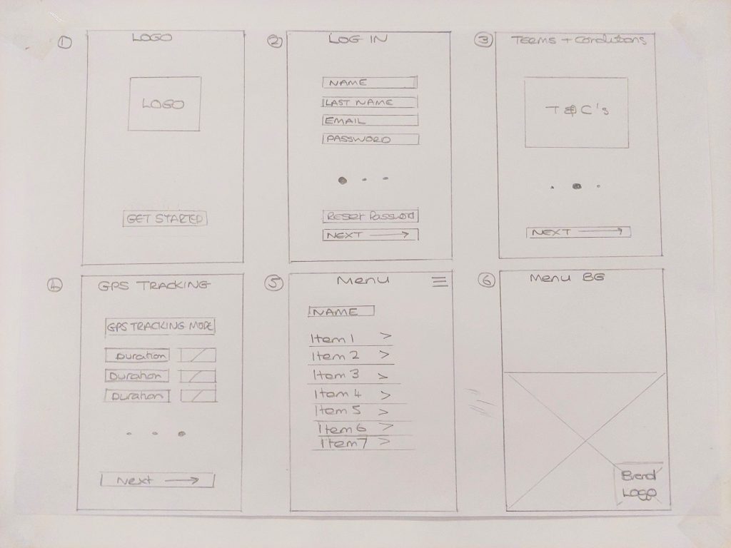
Fig. 3 Second Iteration Wireframe - Heugh (2023)
Fig. 4 Second Iteration Wireframe - Heugh (2023)
Fig. 5 Second Iteration Wireframe - Heugh (2023)
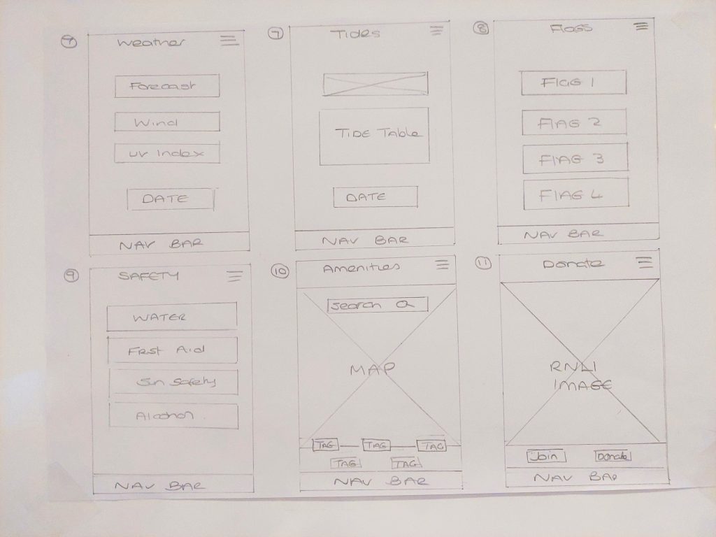
The changes made between the two iterations streamlined the layout making better defined relationships between the pages. These included:
Logo page – Get started button replaced login and register.
The GPS tracking page was changed from a map to select mode as there is another map under amenities thus preventing duplication.
The main menu on page 5 was updated to include brand sponsorship promotion (page 6) as the project features collaborative relationships. The main menu will fly over the the branding as a way of making a feature.
The weather and tides pages will both display a date picker at the end of the pages and thus bring continuity and flow.
The amenities and donate pages have also been given a revised layout with the map and RNLI image taking a large portion of screen real estate to give prominence and aid use.
The emergency page has also been simplified to have the call button in the primary hierarchy position with location and video buttons secondary to give prominence to the call to action state.
I felt that the second iteration improved the look and flow of the project and further additions will be made in the visual mock up. One of the challenges was that there did not appear to be any other water safety apps and some of the decision had to be made without a sense of what was most popular. However it was decided that the information was the most important aspect of this design and it had to be laid out in a simple and uncomplicated way.
References
Bin Uzayr, S. (2022) Mastering UI Mock-ups and Frameworks : A Beginner’s Guide. First edition. Boca Raton, FL ; CRC Press.