This journal entry details the process, goals and learning experiences whilst intiating and developing the Interactive Design Module DM7906. It is reflective in nature and integrates Kolb’s Reflective Learning Cycle (1984) of planning, doing, reflection and conceptualisation with the purpose to gain insights and conclusions throughout the process. This draws upon the experiences gathered from design practice and the development of personal skills.
Personal Goal Setting
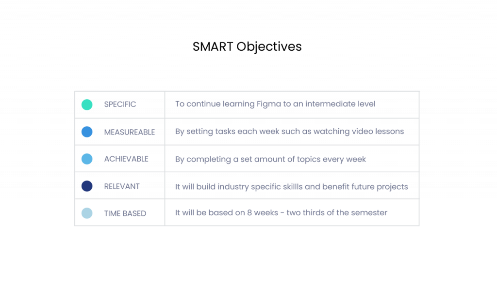
The personal goal for this module was to continue building basic Figma skills that had been accrued from the last assignment. Figma has greater capacity than Adobe XD, with more content to cover and implement, which can have a greater impact on the presentation of projects, so it is a worthwhile skill to learn. This goal was broken up into SMART objectives to facilitate purposeful study (Fig. 1). Video lessons totalled 27.5 hours and were watched over 8 weeks of the semester to allow the design to be finished before testing.
Fig. 1 SMART Goal Objectives - Heugh (2024).
Ideation
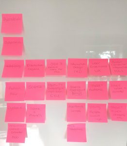
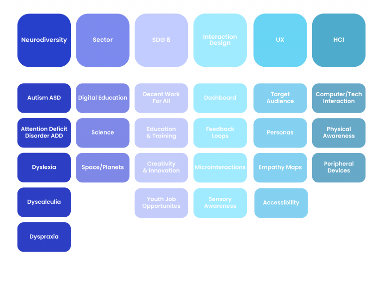
It was challenging to do a traditional mind map with all the different aspects to this project. In order to overcome this, a series of sticky notes were used to instigate a brain storming session (Fig. 2). This provided clarity and helped focus on the main parts of the project. Mind mapping and brainstorming have been some of the more useful activities that are used on the MA as it helps to stimulate ideation and consolidate thinking into an organised cohesion. The image in Fig. 3 show the brainstorming sessiom that became organised into the map below, which helped clarify the relationship between each main element of the assignment.
Fig. 2 - Sticky Note Brainstorm (Heugh, 2024)
Fig. 3 - Sticky Note Mind Map - (Heugh, 2024)
The differences and relationships were initially difficult to clarify especially between HCI, UX and IXD. This linear approach helped to focus on the main tasks of the project. Although neurodiversity was taken into account the project focussed on general accessibility.
Low Fidelity Wireframing
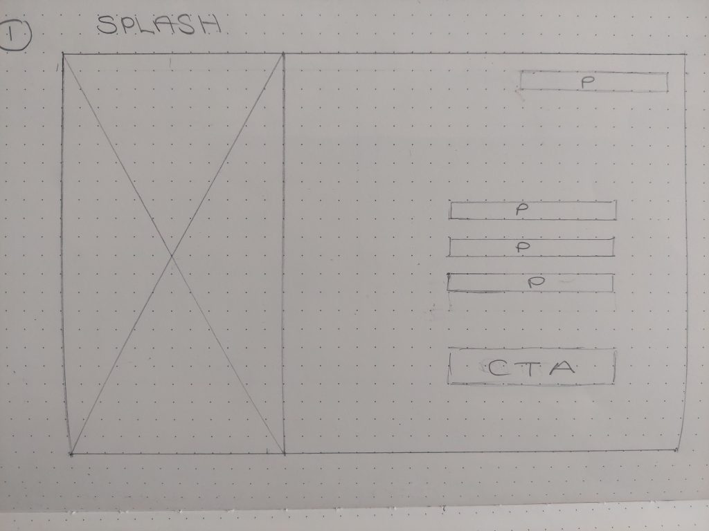
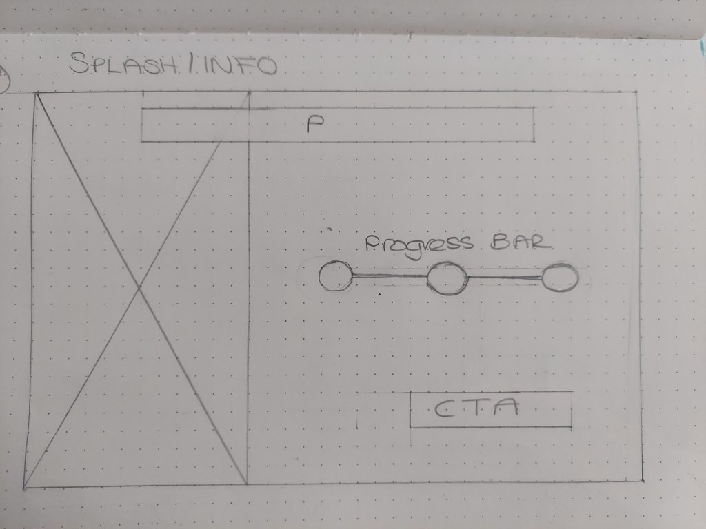
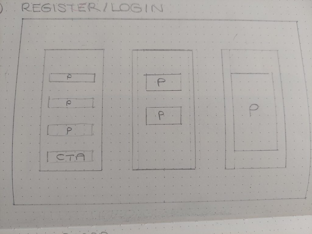
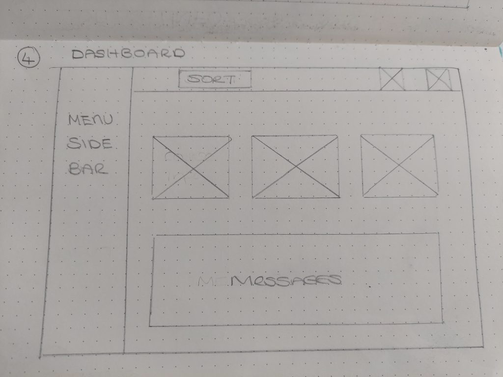
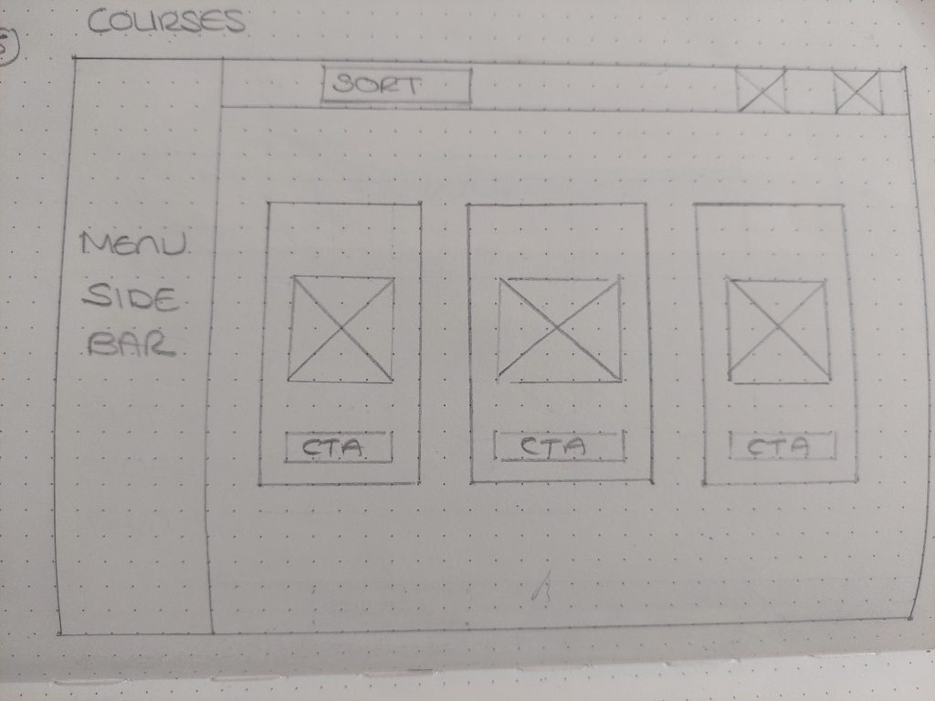
The paper wireframes were straightforward apart from some minor changes that occured when the mock up was completed. The progress bar (Fig.5) was positioned vertically instead of horizontally as it flowed better on the page.
Fig.4 Splash Page (Heugh, 2024)
Fig.5 Info Page (Heugh, 2024)
Fig.6 Login Page (Heugh, 2024)
Fig.7 Dashboard Page (Heugh, 2024)
Fig.8 Course Page (Heugh, 2024)
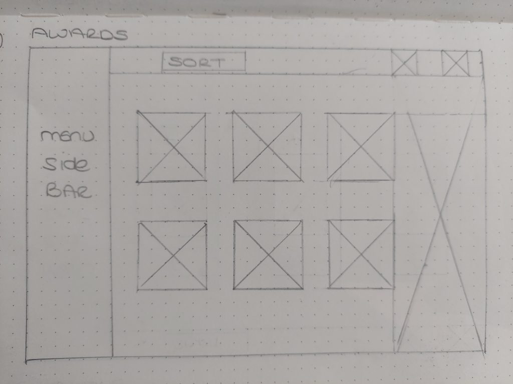
Fig9. Awards Page (Heugh, 2024)
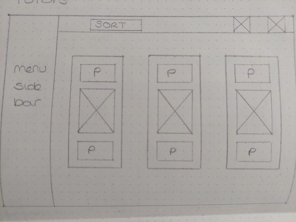
Fig.10 Tutors Page (Heugh, 2024)
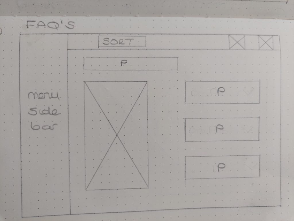
Fig.11 FAQ Page (Heugh, 2024)
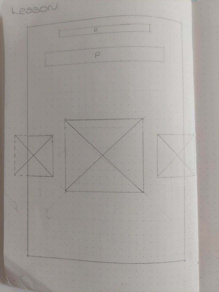
Fig.12 Lesson 1 (Heugh, 2024)
Fig.13 Lesson 2 (Heugh, 2024)
Fig.14 Lesson 3 (Heugh, 2024)
Moodboards
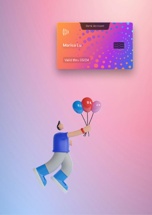
The look and feel of the project was created using skeumorphism with figures obtained from the creator Saly under creative commons use (Fig.15). There are pros and cons for using ready made art. On the positive side they are quick and easy to implement and it gave me more time to work on the interactivity of the project as the focus was not on branding in this module. The negative side is that not all figures can fit the brief and has been a reason that I have not used them before. However, they appeared to work well in the design scheme for the microlearning app. The dots design pattern was inspired by a credit card (Fig.17) and symbolically referenced microlearning with small chunks of learning building into a larger whole. Inital conceptions were carried out digitally due to using existing artwork and the intended use of gradients and a large mix of colour (Fig.16).
Fig. 15 Edu Tech Mood Board (Heugh, 2024)
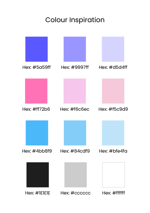
Fig. 16 Colour Palette (Heugh, 2024)
Fig. 17 Ideation (Heugh, 2024)
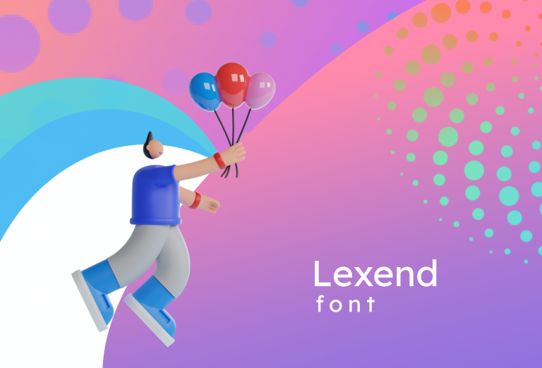
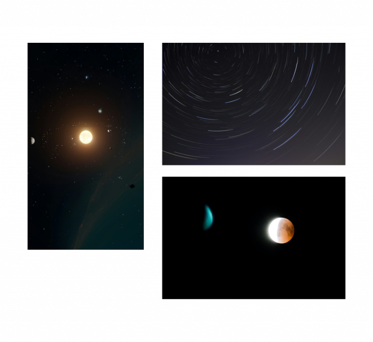
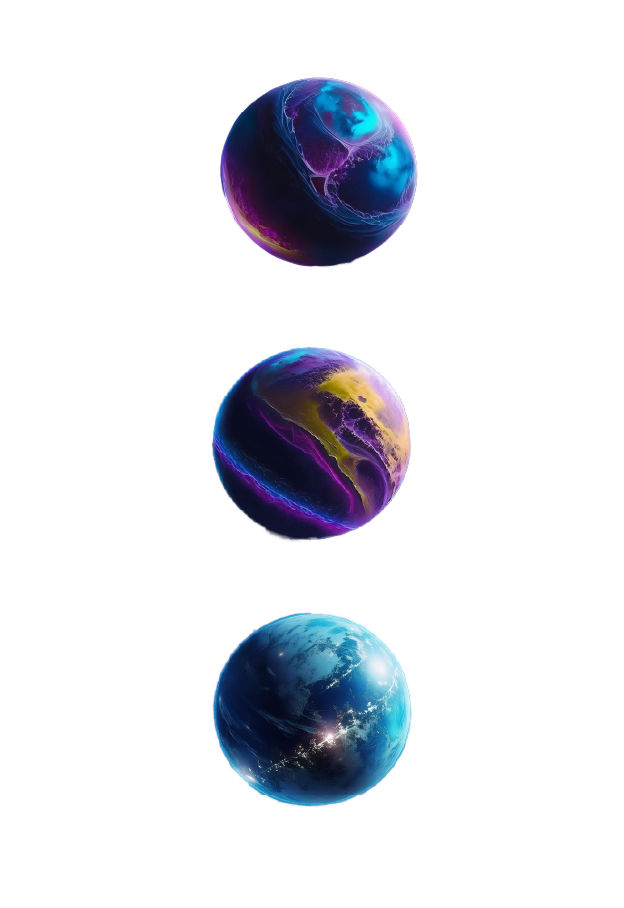
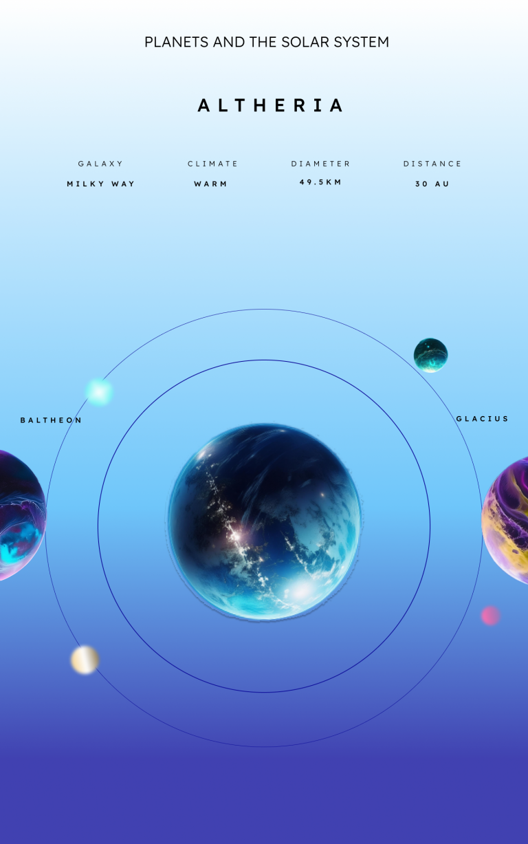
The space lesson board (Fig.18 left) was inspired by figma interactions and the original idea of basing the assignment on a childrens learning platform. The hardest aspect was getting the planets to look right. It took severals attempts on Photoshop Beta AI (Fig.18 right ) to get the desired effects. Runway was also used but did not yield the desired results. The gradients in the space lesson also took several attempts to get right, a lighter version was attempted (Fig.20) but did not have the same impact as the the darker version (Figs.19). The font across both the app and the lesson was Lexend (Fig.21) including the wordmark Edu Tech.
Fig.18 Space Inspiration and AI Planet Images (Heugh, 2024)
Fig. 19 Space Lesson Dark (Heugh, 2024)
Fig. 20 Space Lesson Light (Heugh, 2024)
Fig. 21 Lexend Font Sizes (Heugh, 2024)
Accessibility
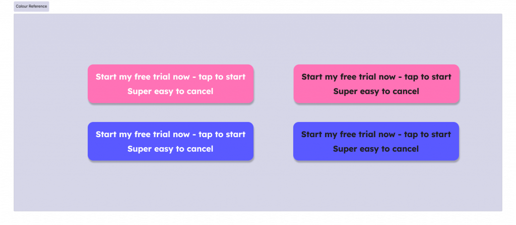
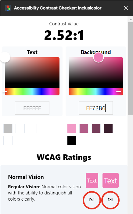
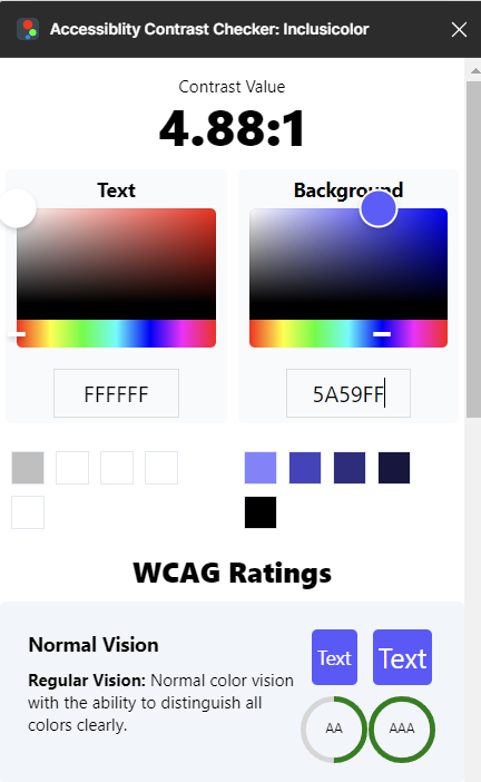
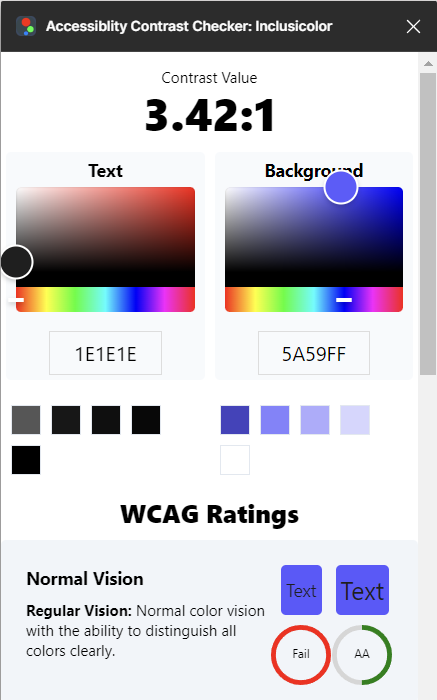
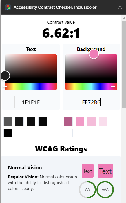
Colour contrast was the biggest issue I experienced when designing the microlearning app. The image below (Fig.22) shows four versions of a call to action button. I preferred white text on pink background, which failed the most at a ratio of 2.52:1 (Fig.23A). I choose white text on the purple background, which passed 4.88:1 (Fig.23B). The best option would have been black text on pink (Fig.23) at 6.62:1, but I though it too stark. The other option black text on purple background (Fig.23C) was rated 3.42:1, which I felt was less accessible than the white text on pink background. I am not sure of how accurate the free colour contrast apps are but some are very expensive, which could make it prohibitive for a small business.
Fig.22 CTA Buttons (Heugh, 2024)
A
B
C
D
Fig.23 Colour Contrast Ratios for Text on Backgrounds (Heugh, 2024)
Conclusion
Overall, the project turned out better than expected and I have learned a lot more about Figma, which was my SMART Goal. It is a vast programme and there is still a lot to achieve to obtain a competent standard. The assignment handbook guided students to think about accessibility and the history of interaction design. This with the SDG Goal 8 has made it a complex module with different angles to consider. Accessibility should be a consideration in design, although I think it may be hard to accomodate all users and I have come to the conclusion that the nuance of colour contrast may be subjective rather scientific, depending on the user.