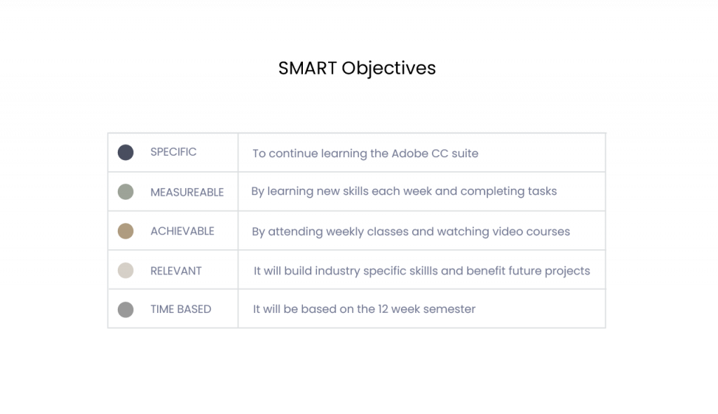
This reflective journal details the processes, goals and learning experiences in the branding strategy module. The purpose is to gain insights and conclusions that develop future personal goals and hilight areas for further improvement. The main aim in this module was to develop further experience in the Adobe CC suite and develop prototyping skills in Adobe XD. These have been formalised into SMART goal objectives (Fig.1 ). The reflection reveals how this externalised through the course of logo ideation and creation and the process of prototyping.
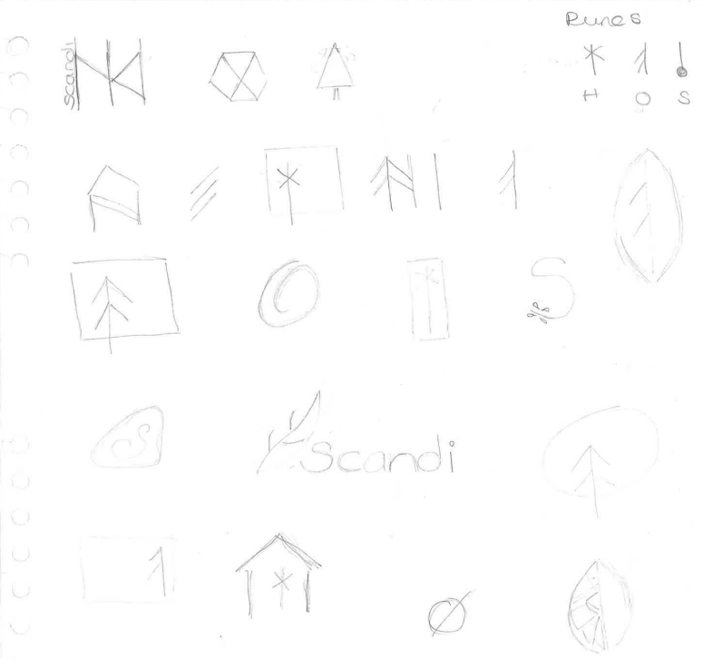
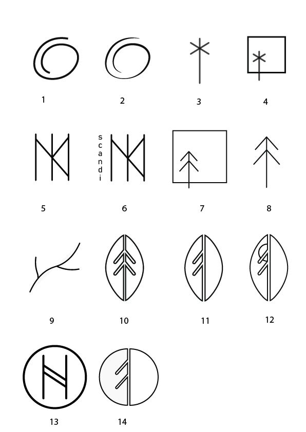
The first design skill was to produce a logo in Adobe Illustrator, which began with online research and drawing some basic sketches (Fig. 2), which would give a reflection of the mood board (Fig. 3). There is a lot of runic symbolism in Scandinavian influenced logos, which I worked with to reproduce some of my own concepts using the pen tool on a 64px grid (Fig. 4).
Fig. 2 Rough Sketches For Logo Ideation - Heugh (2023).
There was some frustration experienced as I felt I needed to have more skills to produce my ideas. It helped that logos are meant to have a simplicity and I arrived at having 14 concepts (Fig. 4). Designs 1 and 2 were created to give a sense of relaxation and unwinding but were not descriptive of the brand. Designs 3 and 4 used the runic symbol for H (as in home) but lacked sophistication. Designs 7, 8 and 9 were too lightweight for a furniture brand. Designs 10, 11 and 12 were promising and needed further development. Designs 13 and 14 were disregarded as they did not resonate with the brand.
Fig. 4 Logo Sketches Reproduced in Adone Illustrator - Heugh (2023).
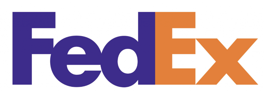
Designs, 10, 11 and 12 were developed further. Chris Do (The Futur, 2019b) suggests that legibility, hierarchy and contrast were considerations to improve a logo design. Design 12 was discarded due to potential sizing issues losing legibility. Designs 10 and 11 looked shield like and this was improved by offsetting the two halves of the logo and producing a hierarchy. The design also incorporates the use of negative space by revealing tree branches and is found in well-known logos such as National Broadcasting Corporation (NBC) peacock logo by Chermayeff and Geismar in 1986 (Chermayeff et al. 2023) (Fig.8 ) and Fed Ex by Lindon Leader in 1994 (Mankoo, 2023) (Fig. 9). The finished design without text is featured in Figs. 5,6 & 7.
Fig. 5 – Logo White On Black Fig. 6 – Logo Black On White Fig.7 – Two Tone Logo (Heugh, 2023).
Fig. 8 NBC Peacock Logo (Chermayeff & Geismar, 1986) Fig. 9 Fedex Logo (Lindon Leader, 1994).
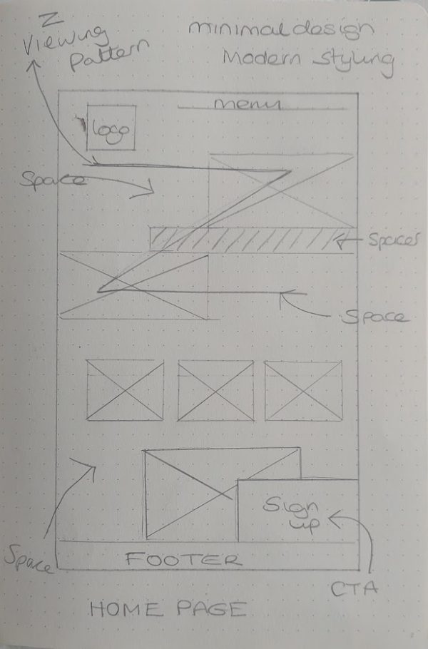
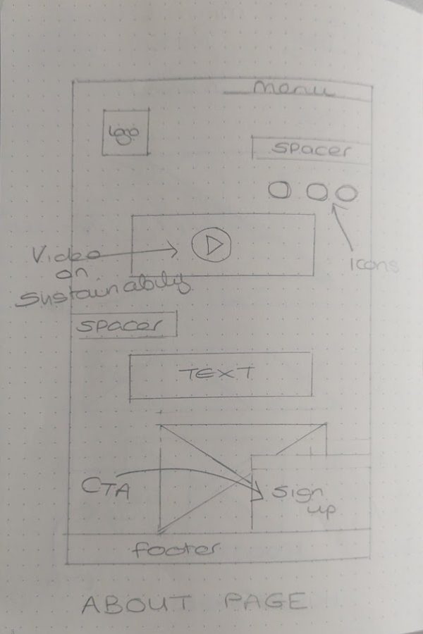
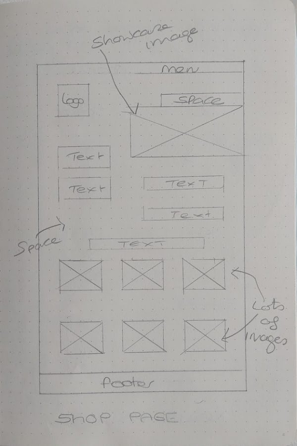
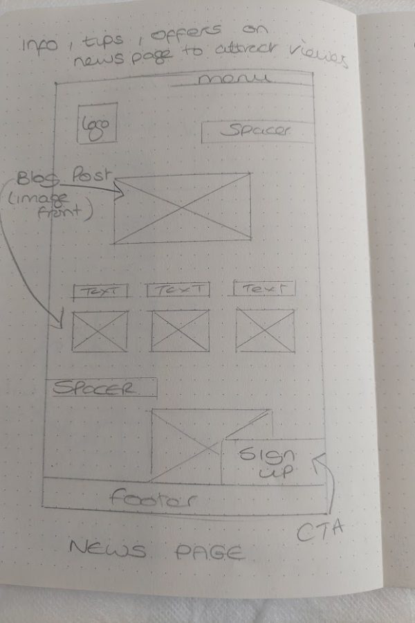
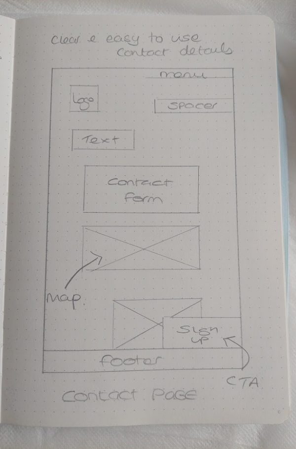
The website design was also sketched out to ensure consistency and ease of use (Figs. 10 -14). It follows the Z pattern of reading to aid user experience. The layout was kept simplistic to allow white space to reflect the minimalistic brand style and also to show the imagery off without visual clutter. The design was then transferred into Adobe XD for mid fidelity wireframing, which may be viewed in app here: https://xd.adobe.com/view/0d6dfa0d-0f47-4297-b8e1-cf5a65cba603-583e/
There was a learning curve in using Adobe XD and two courses were taken, paid and unpaid to understand the software. The software uses virtual pixels and is therefore better to visualise the relationship between the elements, rather than strive for pixel perfect measurements (Adobe, 2016). This provides design issues as the placing of elements are not perfectly aligned across every artboard. Responsive viewports also had to be achieved manually. There is also a lack of true font and character spacing, which would have to be clarified to clients and in user testing. One of the advantages of using Adobe XD is that it uses the same interface as other Adobe programmes making it easier to navigate. Assets can be easily transferred through the Adobe libraries streamlining the wireframing experience.
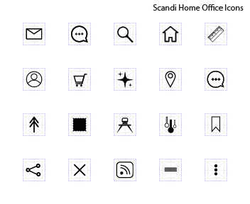
Overall the project went well although occasionally it felt time had been wasted. An example is the creation of icons of which few were used (Fig. 15). There are many that can be downloaded, although this appears easier in Figma, however the creation of these really helped with gaining Illustrator skills.
Fig. 15 - Scandi Icon Designs - Heugh (2023).
The SMART goals had been met through the attendance of weekly Adobe CC Classes and through the learning of 2 Adobe XD courses. For future development, I would like to learn Figma and streamline my time through the use of stock assets like icons to produce a more efficient workflow