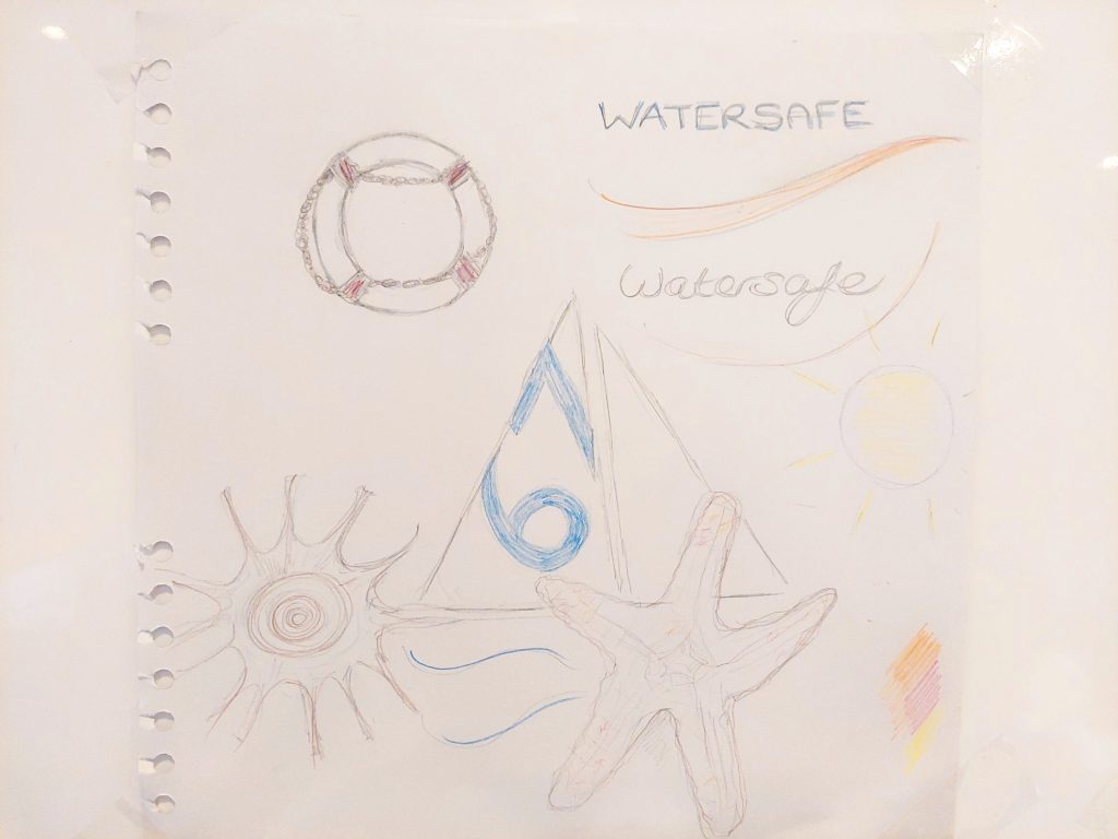
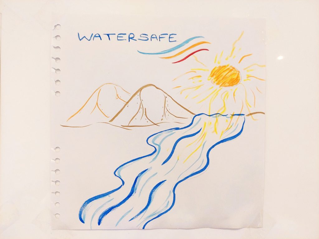
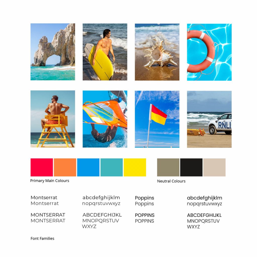
This post considers the visual identity of the Watersafe project and the learning curve in building a brand identity. This started off with some sketches (Figs. 1 & 2) where the concept was a more whimsical approach with outline shell drawings faded into the app backgound. The research and the target audience, however, proved that this would be too idealised for an application targeting millenials providing safety information. The aim was to reach surfers and mums alike and there had to be a balance between being approachable, informative and slightly cool. The mood board constructed below felt more in line with what was required and this was used as reference for colour, imagery and text.
Fig 1. Sketch 1 - Heugh (2023)
Fig 2. Sketch 2 - Heugh (2023)
Fig 3. Moodboard - Heugh (2023)
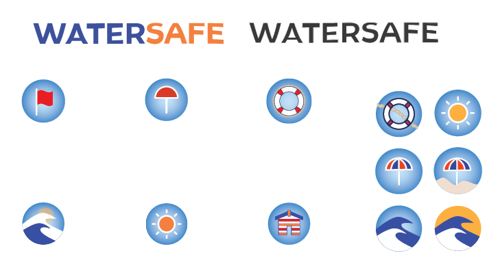
The logo idea came from designing icon ideas in Adobe Illustrator and not from the sketching directly (Fig. 4). The waves not only signify the movement of water but how they can become volatile and had a surfer vibe to them, so I felt that it fitted the target audience. There were many iterations of the logo and icons. It can be seen on the artboard that some became more simplified in order for them to be scaled and not lose detail. The logo was also designed in orange (Fig. 5) and I did like this combination but it reminded me of a chandlery as it it a popular combination in the sailing world, however this was used in the word mark and call to action buttons to provide some bright contrast. There were other colour option that would have worked illustrated in Fig. 6, which makes the design more vibrant.
Fig 4. Illustrator Artboard - Heugh (2023)
Fig 5. Orange Logo Variant - Heugh (2023)
Fig 6. Page Colour Variant - Heugh (2023)
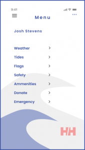
Fig 7. Frosted Fly Over - Heugh (2023)
One of the goals that was set for this project was to learn Figma and improve layout skills. It was a struggle to get Figma to work properly and I realised that it probably preferred running on Google Chrome. I had similar issues in the past with software and changing browser did work in this case. I thought that Figma would be similar to Adobe XD and to a point it was, but the learning curve is steeper with Figma as it has a lot more capability and range. There was an issue where I could not get the fly over menu to stay white in the prototyping stage. The fly over menu worked but had a reduced opacity and would not retain colour after the transition had completed. I tried every combination to get this to work and wondered whether this would be achieved with a paid subscription, however Fig. 7 shows the transition complete. Although the tasks for the project were completed, I know there is a lot more that could be achieved with Figma given more time to learn the programme.
Overall, I felt that my design skills improved mainly because I am more familiar with the creative software, however this is a continual work in progress and I will continue to practice and develop further.