Interaction Design DM7906
How can interactive design help those with accessibility barriers to get fairer access to education and learning? This project proposes a microlearning dashboard to promote greater awareness to support learning and aid workplace integration.

1.0 Introduction
This assignment considers the role of Interaction Design (IXD) in the design process and its application in the development of a microlearning dashboard for those with accessibility issues. The dashboard will be designed through the iterative design thinking stages of empathise, define, ideate, prototype and test (Plattner, 2007) and address the relevance of Sustainable Development Goal (SDG) 8 (UNRIC.org, 2024) and how decent work for all may be achieved for those experiencing barriers to accessibility.
The project is a reflective study and integrates Kolb’s Reflective Learning Cycle (1984) of planning, doing, reflection and conceptualisation with the purpose to gain insights and conclusions throughout the process. This will draw upon the experiences gathered from design practice and the development of personal goals that are detailed in the reflection journal. The reflective journal for the project may be viewed here: https://designerdigital.uk/interaction-design-dm7906-reflective-journal/
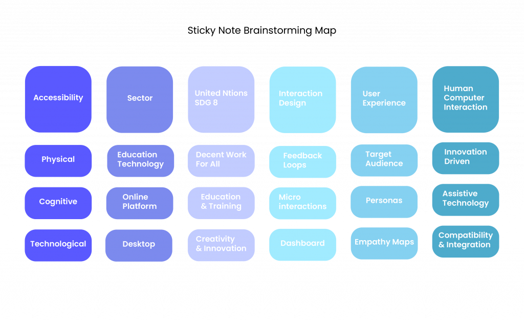
The following section investigates the background of Interaction Design (IXD) (1.1) and its role in the development of digital products for those with accessibility needs. The Sticky Note Brainstorming Map reflects the various aspects that were considered in this project and used to guide the assignment process.
1.1 Background
Interaction design (IXD) evolved as a branch of Human Computer Interaction (HCI) since the early 1980’s. The advent of personal computing and its widespread implementation into the workplace, founded other core concepts such as user design and direct manipulation (Dix, 2017). IXD was relevant to software in particular and was concerned with the notion of behaviour, animation, sounds and shapes in software products (Moggridge, 2007; Siang, 2021). The early days of personal computing focused on allowing users to accomplish tasks and thus was originally utilitarian in nature.
Technological advances shifted the HCI and IXD paradigms. This is witnessed by the phenomena of collaborative working, a concept only possible since the advent of local and wide area networks with emphasis transferring to group interaction to support widespread work practices (Hook, 2018). HCI and therefore IXD could be considered a by-product of innovation.
In recent times, interaction design assumes that users work with devices in an interactive, feedback loop. Human interaction is complex and involves understanding the dialogue of people, culture, ability and sensory engagement to achieve product success (Hook, 2018). The HCI and IXD paradigm shift now transforms utility and task productivity to one of enjoyment and positive user experience (UX).
This shift enables sophisticated communication systems between a device and its user. It is particularly useful in interacting with those who have physical or cognitive needs, as feedback loops can act as a verbal or non-verbal immersive experience for expression and learning by reinforcing, guiding and correcting a user’s understanding of the system. Feedback loops coexist with affordances and signifiers (Roth, 2021), which offer information before, during and after an interaction. Affordances is a term coined by Gibson (1977) and later modified in design (Norman, 1988) to indicate ‘perceivable action possibilities’, thus users will consider actions that they perceive as possible (Interaction Design Foundation, 2016a) which relies on individual ability and perception. An example of this working together is a button hover state, which alerts the user of a consequence, if the button is pressed. The hover state (usually a change in colour) is a signifier, a cue that an action will be performed if the button is pressed. The button itself affords the act of pressing and thus signifies to the user the relationship between the button and the subsequent action that can take place. This coexistence is a fundamental element in accessible design and is often used in digital applications to alert users of impending actions and consequences.
The next section (2.0) will investigate Sustainability Development Goal (SDG) 8 and the World Wide Web Consortium in relation to work and accessibility.
2.0 Sustainability Development Goal 8 and The World Wide Web Consortium
This section appraises Sustainable Development Goal 8 (2.1) and how it affects work and education. Section 2.2 investigates the guidelines produced by Worldwide Web Consortium (2.2) and how it translates in accessible design (2.3).
2.1 Sustainability Development Goal 8
Sustainability Development Goal (SDG) 8 – Decent Work and Economic Growth is part of the United Nations 2030 Agenda for Sustainable Development, which aim to develop employment opportunities for all women and men, including young people and persons with disabilities, that in turn invigorates economic growth and expansion (Grimshaw & Kuhn, 2019, p. 58). In order for all people to have the same access and potential to employment, it is essential to ensure digital accessibility and education infrastructure. Educational technology has made huge advancement through digital innovation especially since the pandemic era due to the convenience of hybrid learning. Its popularity has increased engagement through its versatility and the novel use of ChatGPT and immersive technologies (Ramirez, 2023) and thus digital learning is ideal for upskilling and providing education for those that cannot attend due to commitments, distance, finance, health or functional issues.
However, despite the surge of education technology there are deficiencies in online accessibility for those who have physical and cognitive considerations. According to Botelho, (2021) these are rooted in digital, physical, legal, social and economic factors. Accessibility issues are therefore not only considerations for designers, but for a wide variety of decision and policy makers if the goals of UN 2030 Agenda are to be sustained. Demands on accessibility however are set to increase over the next thirty years, where it is estimated that half of the world’s population will be affected by some degree of disability (WHO, 2024).
2.2 World Wide Web Consortium (W3C)
The World Wide Web Consortium (W3C) formulates standards and guidelines for web based development regarding accessibility, privacy and security on an international basis. It works with the public and organisations to drive core web technologies and to exchange ideas with industry and research leaders. It has developed the Web Content Accessibility Guidelines (WCAG), an international resource to make web content more accessible to those with disabilities. These have five main classifications: visual, motor, auditory, speech and cognitive categories, which may also be modified to regional specific law (W3C. org, 2024).
2.3 Web Content Accessibility Guidelines and Design Requirements
In design, accessibility requirements fall into two main areas: (1) information bearing elements, which must have a contrast ratio of 4.5:1 and (2) decorative and disabled elements, which have no compliance. Large text – 14pt bold and 18pt regular should meet a minimum contrast ratio of 3:1 as should user interface (UI) controls, which should identify how they are to be used. Information may not be colour dependent and therefore should rely on other descriptors to allow screen readers and visually impaired users to understand content.
The next section considers the business case for accessibility and its viability in design practice.
3.0 Business Case For Accessibility in Digital Products
According to the Bureau of Internet Accessibility, there are beneficial reasons why a business should incorporate accessibility into their digital products:
- To avoid discrimination and legal complaints – there are several laws that enforce accessibility as a legal right although this mainly appears to be enforceable with public sector organisations with legislation such as the Equality Act 2010 and the Public Sector Bodies (Websites and Mobile Applications) (No.2) Accessibility Regulations 2018, which must comply with WCAG standards by being perceivable, operable, understandable and robust (POUR) (Harris, 2020).
- To reach a wider audience – there are estimated to be 1.3bn (approx. 16%) people worldwide that have a disability (WHO, 2024). The addition of extra accessible features such as:
- Closed captions and transcripts for video to assist those with hearing and cognitive issues.
- Colour contrast that can assist visually impaired consumers.
- Streamlining processes such as shopping cart checkout pages, which may help those with memory impairment but also improve general conversion rates.
- To build positive public relations – A study by Accenture (Davies, 2018) revealed that 63% of consumers are more likely to purchase from companies that reflect their values. A socially responsible organisation is more likely to appeal to consumers by incorporating an accessibility manifesto.
- To improve SEO – Google ranks pages by text descriptors, thus good design should include titles, meta descriptions, alt text and transcripts, which inform the browser if they reflect the search terms and are useful to the user (Google Search Central, 2024).
- To incorporate best practice coding – semantic coding that is recognised by screen readers are faster loading and rank higher in search engine optimisation.
4.0 Design Process
The preliminary research is taken forward to the design thinking stages. This chapter considers the Three Lenses of Design Thinking (IDEO, 2009) in section (4.1).
4.1 Design Process
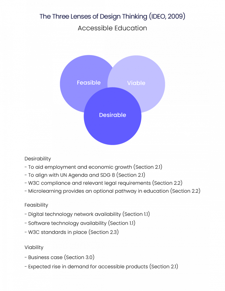
The Three Lenses of Design Thinking (IDEO, 2009) considers whether a project has commercial, technological and social tenability (Fig.2). User needs are considered first, as a lack of product desirability is unlikely to prove viable regardless of its feasibility. The figure below lists the main considerations from the research investigation.
The next section implements Plattner’s (2007) Five Stages of Design Thinking.
5.0 The Five Stages of Design Thinking
The Five Stages of Design Thinking (Plattner, 2007) is an iterative design model implemented to guide the design process. It consists of five stages: empathise (5.1), define (5.2), ideate (5.3), prototype (5.4) and test (5.5).
5.1 Empathise
Empathy is a way of understanding others and is used in design approaches such as Human Centred Design (HCD) and Design Thinking (DT) and their association with successful project outcomes (Chang-Arana et al., 2020). The designer seeks to understand the pain points and subsequent needs, wants and emotions from the perspective of the end user. According to Texas A and M University (2024) “digital accessibility is providing digital content that everyone can access, understand, navigate and interact with”. They posit that equality and equity are dual features of accessibility. The same information may be displayed to all users (equality) but it should be modified for any challenges that users may encounter (equity) suggesting that accessibility is an individualised process.
5.1.1 Interview
To develop a further understanding of the complexities and how it relates to those with accessibility issues, an interview was conducted with a specialist University tutor, which provided insight into formulating the personas and empathy maps in the next phase. The main findings are reproduced as an infographic (Fig. ).The transcript is available by clicking on the interview transcript button below.
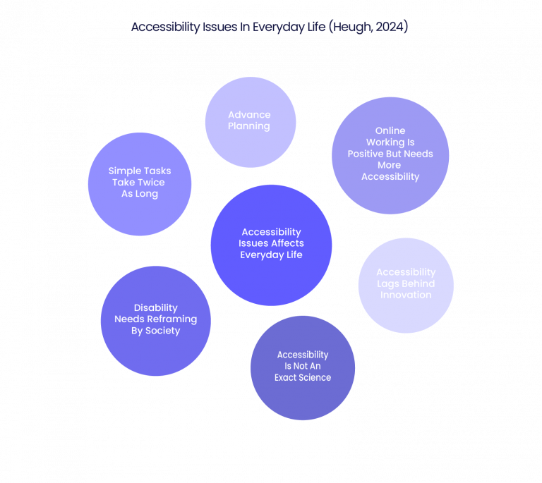
The interview yielded important areas of concern regarding digital accessiblity. It affects everyday life with the planning of simple tasks taking twice as long, which invariably leads to frustration. Accessiblity does lag behind innovation and is not an exact science, an area perhaps that designers are not fully aware. There is also a need in society to reframe disability and accessibility needs as a standard practice, rather than an anomaly that only a few users require. This does translate into corporate websites that could offer atypical users to find emplyment. The advent of online and hybrid working that has emerged over the decade or so (Section 1.1), providing employment for those with accessiblity issues if they have suitable infrastructure in place. The interview is congruent with Botelho (2021) in that accessibility is dependent on digital, physical, legal, social and economic factors (section 2.1) and although not solely a responsibility of the designer, they have an important role in its evolution when user experience is considered.
5.2 Define
The second stage of design thinking defines the problem and formulates the target audience and personas that are likely to require accessible digital products. The interview reveals the difficulties and challenges that students encounter, especially having to plan their life in advance and the ensuing frustration. An interesting aspect was that not all accessibility issues are an exact science or can be generalised beyond a certain point. An example was that some students preferred softer, pastel backgrounds when reading text, which differs with the high contrast ratio for those with sight related challenges. The Business Case (3.0) also suggests that SEO (2.4) is improved due to semantic descriptors that support clarity, which helps those with understanding text, images and content relevance though hierarchy and meta description. This is helpful to those who rely on screen readers and to all users that need clear, structured information. An example of a neurotypical user seeking accessibility is one that seeks clear and unambiguous information, such as an immigrant with different language and cultural expectations These two examples form the basis for the personas.
5.2.1 Target Audience
The target audience can be defined as anyone who requires accessibility and is focused into two main groups – neurodiverse and neurotypical. Although this assignment is based on general accessibility concerns, neurodiversity is a factor in accessibility. According to The Brain Charity (2024), “neurodiversity is a concept that brain difference are natural variations rather than deficits, disorders or impairments”. They estimate that at least 20% of the UK adult population has some form of neurodiversity such as Autistic Spectrum Disorder (ASC), Dyslexia and Attention Deficit Hyperactivity Disorder (ADHD). The term neurotypical is used to describe standard brain processing function. Microlearning has no specific target audience available. Microlearning has been classed as employee based learning that is used to provide specific role-based knowledge (Fortune Business Insights, 2024) and therefore would include a large and varied target audience dependent on the learning manifesto of the company. The personas are therefore based on university educated users that utilise microlearning for different reasons to achieve career success.
5.2.2 Personas
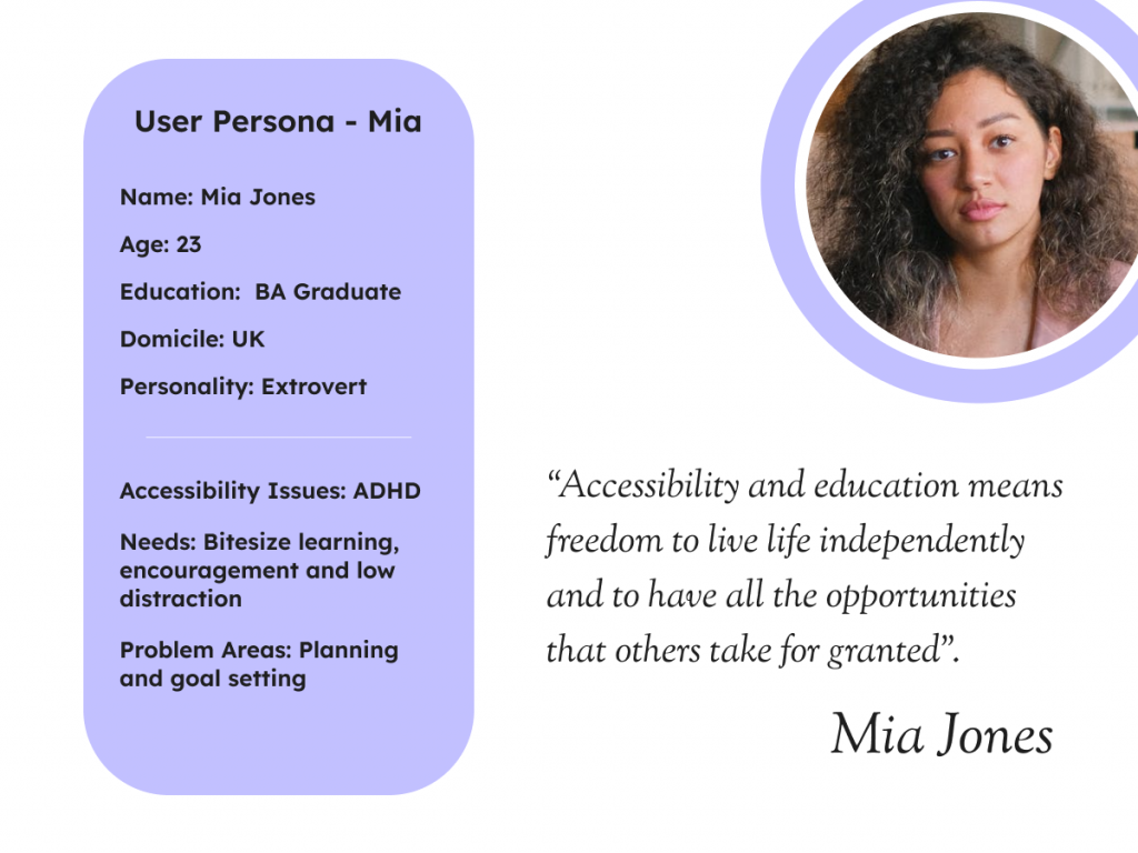
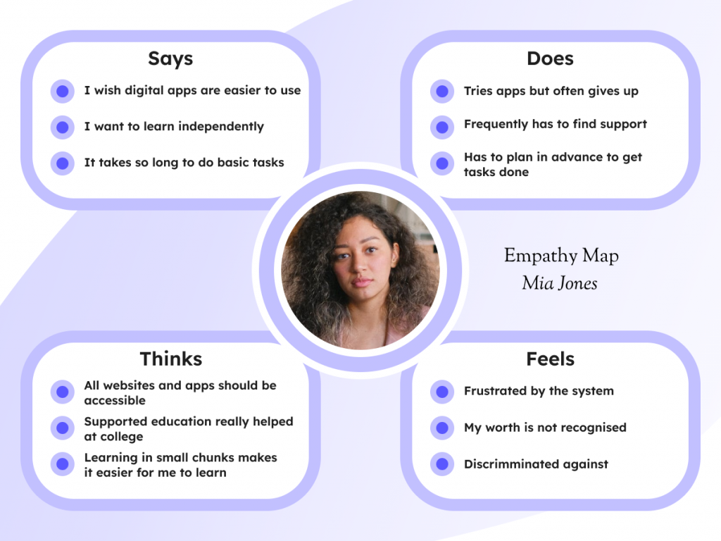
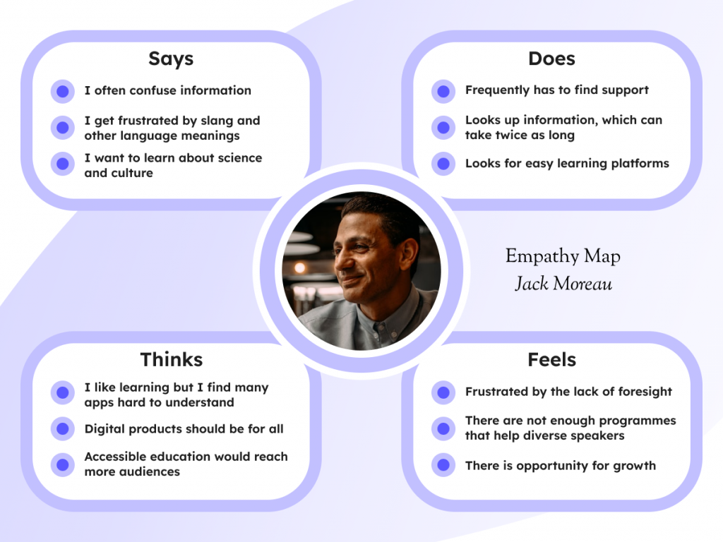
The personas are based on two digital users. The first is Mia (fig.5), a recent graduate who wants to find better opportunities at her part-time work. She experiences difficulties with Attention Deficit Hyperactive Disorder (ADHD), which means she benefits from bitesize learning that does not require long periods of concentration. The second is Jack (fig.6), a neurotypical, French immigrant who has difficulties with clarity and sometimes understanding information. He wants to be successful but worries that he might make linguistic and cultural mistakes.
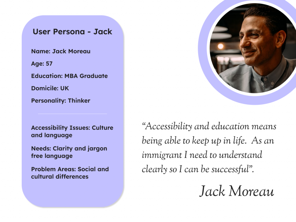
The personas were translated into empathy maps, which provides an insight into the specific thoughts, feelings, speech and actions of those who face accessibility challenges (figs. 7 & 8) and can be used as a guide for designing the user interface.
5.3 Ideate
The ideation phase seeks to challenge the status quo by utilising new knowledge gathered in previous phases to forge new concepts and designs. Gibbons (2016) suggests “sharing, mixing and remixing, building on others’ ideas”. This process was initiated by competitor analysis of two microlearning apps Deepstash and Go Learn (Google Play, 2024) (section 4.4.1), followed by site architecture design for accessibility (section 4.4.2), a curated mood board (section 4.4.3) and a low fidelity wireframe (section 4.4.4).
5.3.1 Competitor Analysis
In this phase of the design process, existing microlearning applications – Deepstash (Google Play, 2024) (fig.9) and Go Learn (Google Play, 2024) (fig.10) were investigated to determine strengths and weaknesses (figs ) that could be improved upon in a new design.
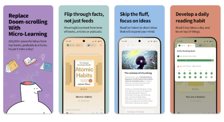
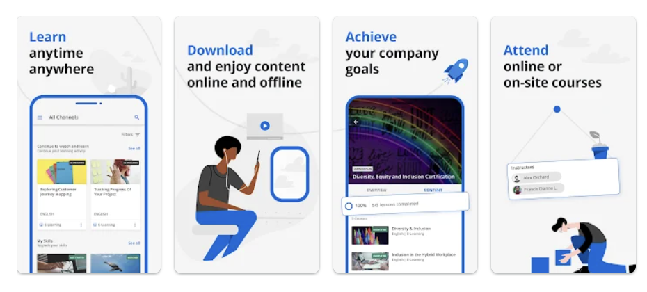
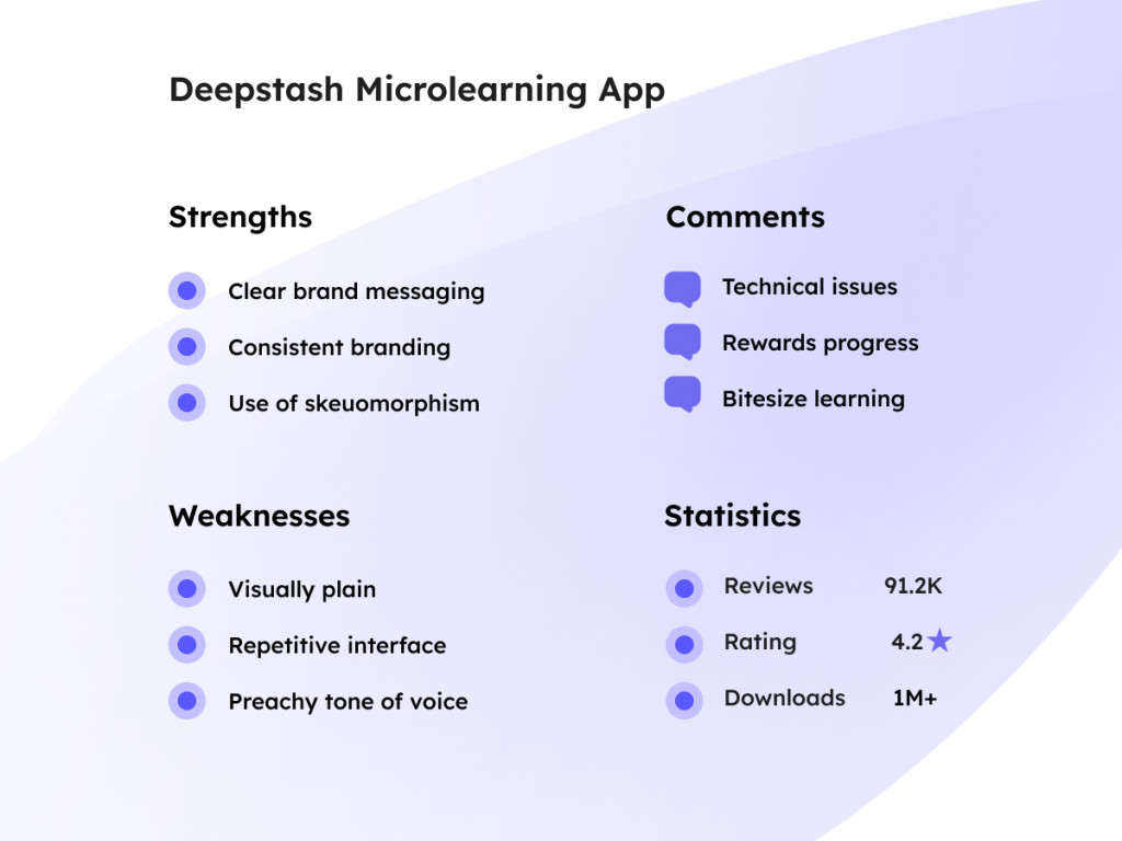
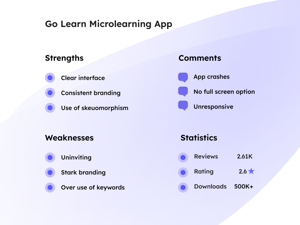
The strengths and weaknesses of both apps were similar. They both displayed consistent branding and utilised skeuomorphism, which offers a visual language that mimics real world elements. This provides the brand with a sense of familiarity and ease that is welcoming to the user (Wojciechowski, 2023) and is suitable for accessibility design as it offers affordances with visual representation (Interaction Design Foundation, 2016b). The interfaces of both apps were uninspiring and could have benefitted from some styling features. Deepstash incorporated a rewards system, which offers encouragement to the user. The tone of voice was an issue with both apps. The Deepstash app had a slightly preachy tone about doom scrolling and Go Learn hilighted keywords in their header text, which appeared very contrived. Go Learn had no full screen option, which could be an issue for those who need clarity and space. These elements were considered in constructing the architecture and styling for the app.
5.3.2 Architecture
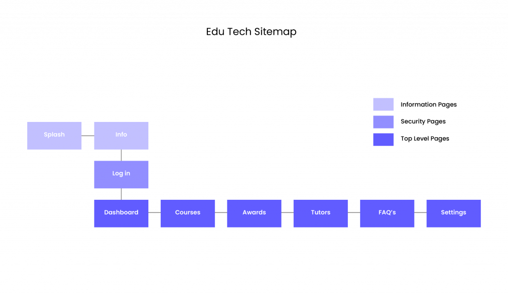
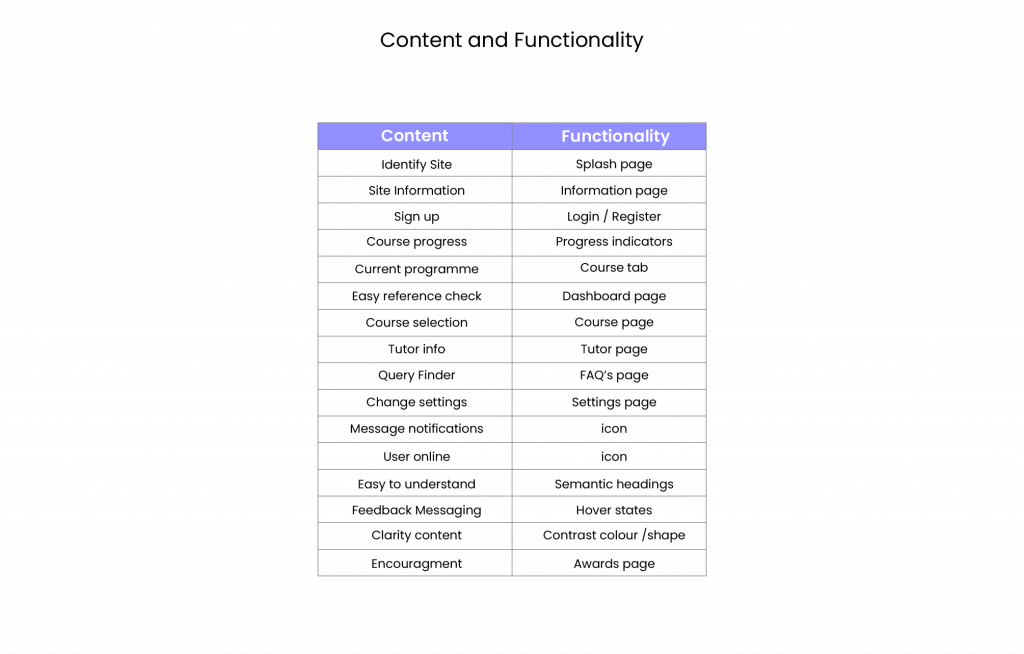
The architecture is the structure formed by the content, functionality and navigation of a design. The sitemap (fig.13) depicts the skeleton of the app displaying a flat hierarchy, which is more navigable when categories are easily identifiable (Whitenden, 2013) There are six categories, which aligns with Millers Law (Laws of UX, 2024), that proposes a maximum recall of nine categories is desirable for an average person to familiarise. The content has been arranged in a progressive order that emulates Hick’s Law (Soegaard, 2020) to minimise cognitive load. This is demonstrated in the onboarding process with the splash page introducing the site to the user, which leads to an information page and then to a sign up/log in page allowing users to understand the process in an easy format, which will become more obvious in the low fidelity wireframe. The content and functionality are listed in table fig.14, to ensure that the challenges of the personas are met such as clarity and encouragment for empathic user experience.
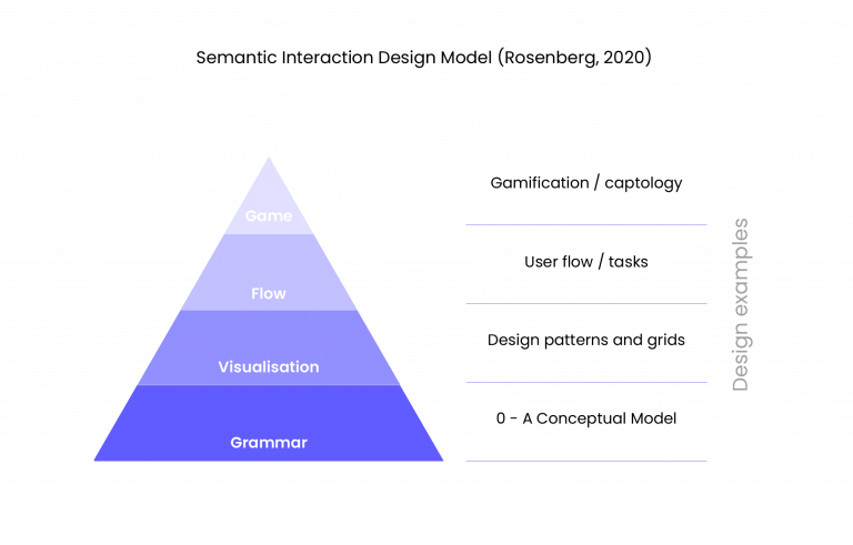
The content and functionality need to be effective and efficient avoiding any inconsistencies that may affect user experience. The Semanatic Interaction Design Model (Rosenberg, 2020) (Fig.15) considers four points of interaction relationships in semantic design – 1. Grammar – between functionality and user goals 2. Visualisation – grid layouts following recognised patterns 3. Flow – how navigation, content and actions advance tasks 4. Game – how specific actions reward user behaviour. This is pertinent especially to accessibility design as it challenges the designer to consider each step of the design process to ensure that it is understood by the user and that they are rewarded by their interaction such as button hover states, interactive cards, drop down boxes and an interactive lesson, which are demonstrated in the Figma mock up Section 5.4.3.
5.3.3 Concept Board
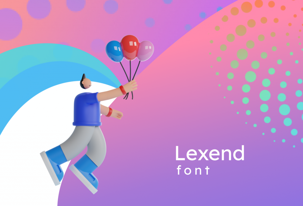
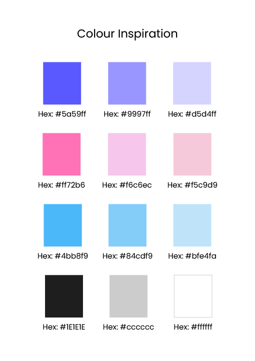
In this part of the ideation phase, a curation of inspirational material is gathered to form a concept board. Eckert and Stacey (2000, 531) refer to this as the “conceptual phase” where new ideas emerge from existing ones. It employs cognitive processes, that are described as “visual attention” (Goldschmidt & Smolkov, 2006) and “semantic processing” (Goucher-Lambert & Cagan, 2019), linked in design through the imagery, symbolism and science of semiotics through the work of such as Ferdinand de Saussure (1857 – 1913) and Charles Peirce (1839 – 1914). The board (Fig. ) represents a vision of the design elements using skeuomorphism that has proved popular in section (4.4.1) and the use of soft gradient backgrounds (sections 4.2.1. & 4.3). The pattern of circles represent the bitesize character of microlearning, building into sizeable knowledge, which would be effective in a brand design. Please view relective journal for further design inspiration: https://designerdigital.uk/interaction-design-dm7906-reflective-journal/
5.4 Prototyping
A prototype is a way to test the potential of a design without spending a lot of resources. It provides a platform for testing, communication and to ideate and problem solve. It consists og three stages low fidelity (5.4.1), mid fidelity (5.4.2) and high fidelity and interactive prototype (5.4.3).
5.4.1 Low Fidelity Wireframing
Low fidelity wireframes are basic visual guides that are carried out on paper to support rapid ideation. They are used in the early stages of design to brainstorm and create potential solutions that benefit both users and business goals. They help in part decide the viability in a technological sence (Section 4.1) by the arrangement of navigation and site architecture (Section 4.4.2) and the skeleton for the prototype (Interaction-design, 2016c). The paper sketches are available in the reflective journal page here: https://designerdigital.uk/interaction-design-dm7906-reflective-journal/
5.4.2 Mid Fidelity Wireframing
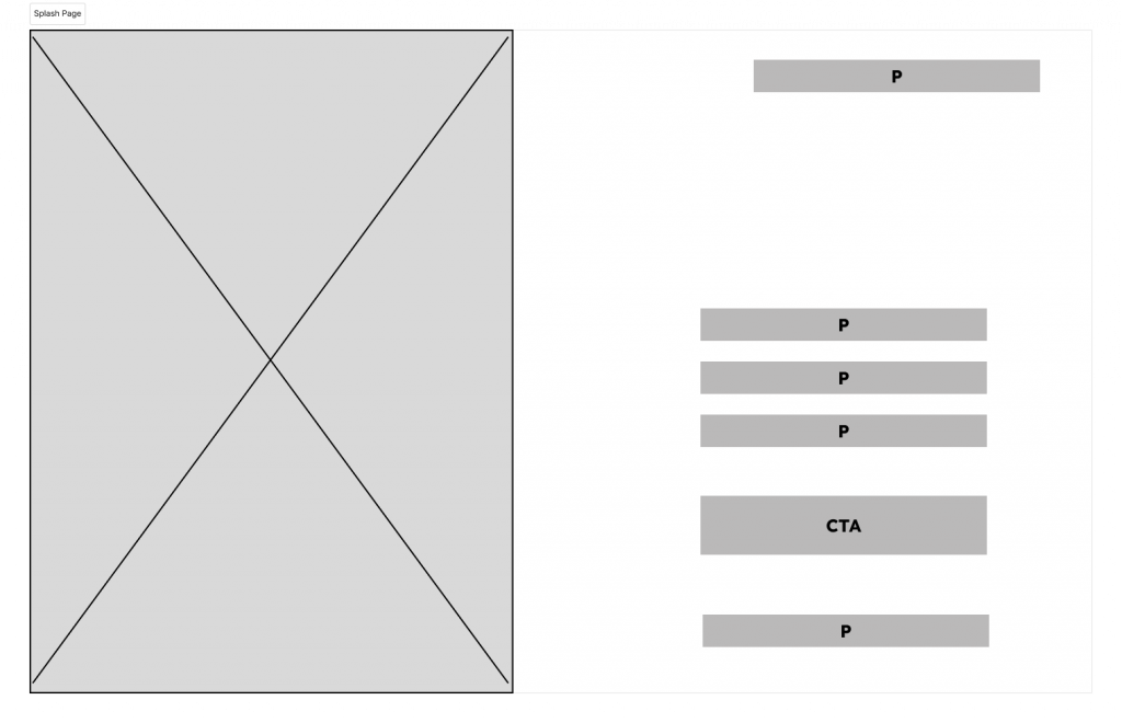
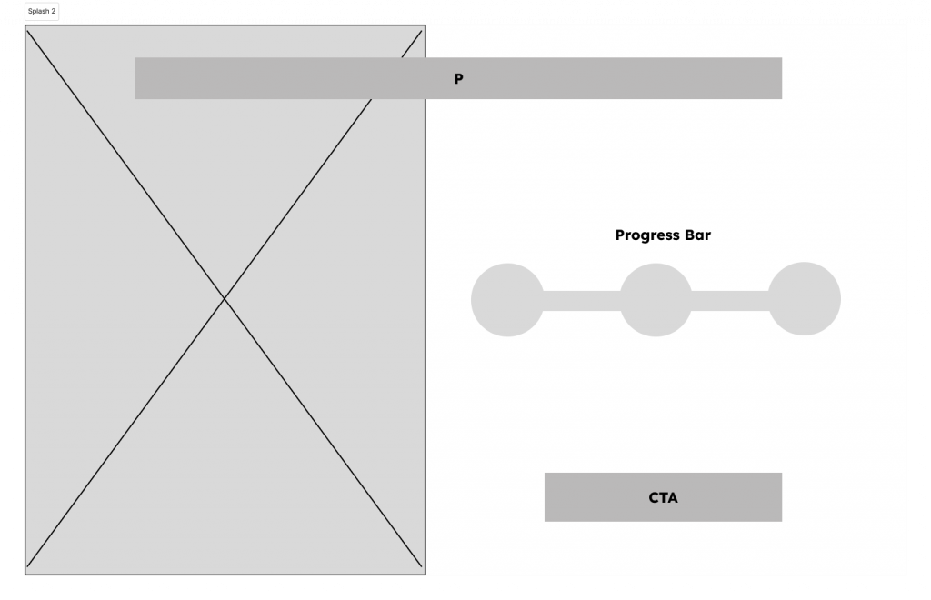
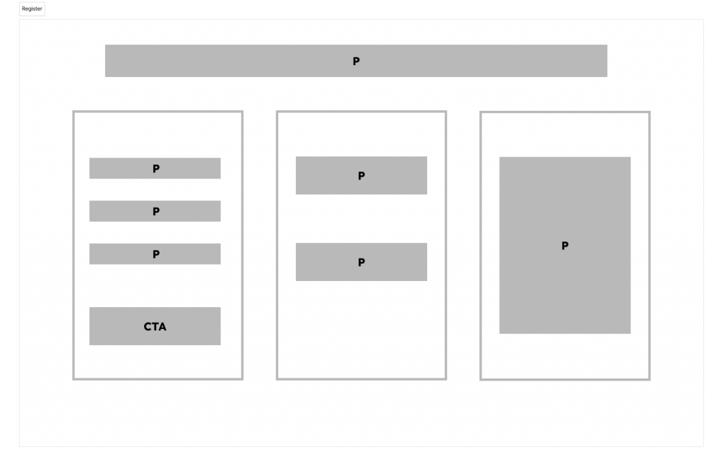
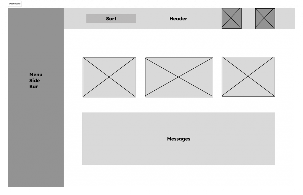
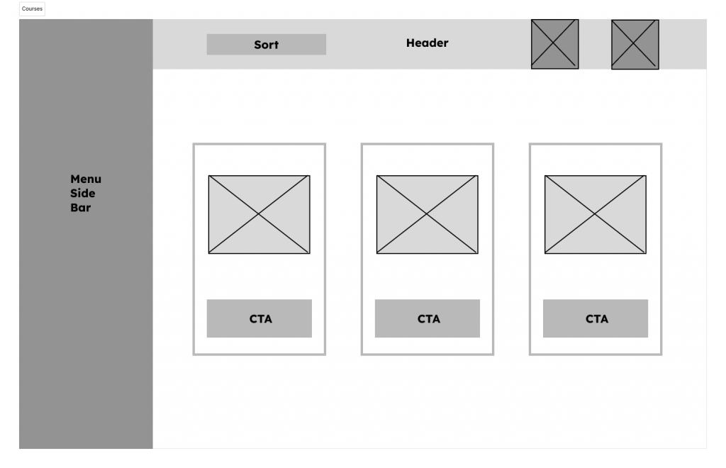
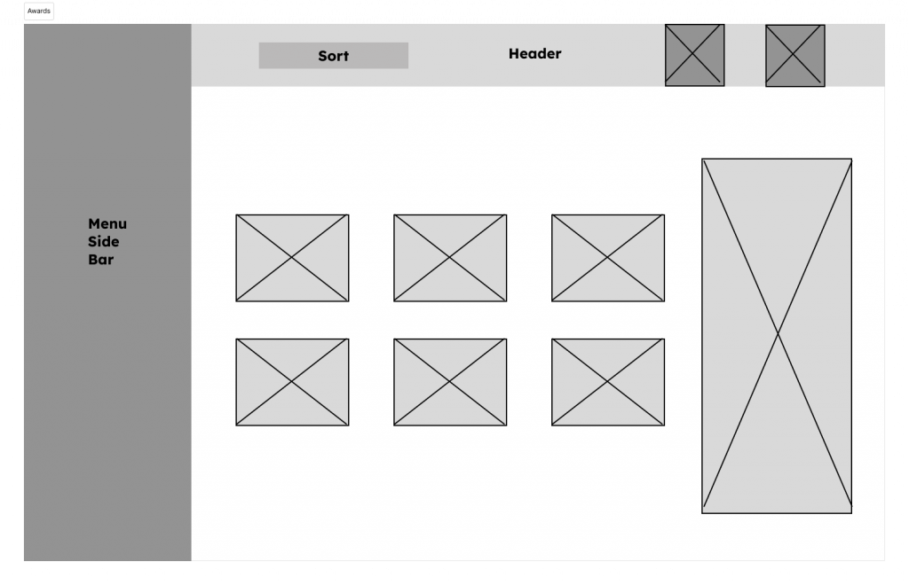
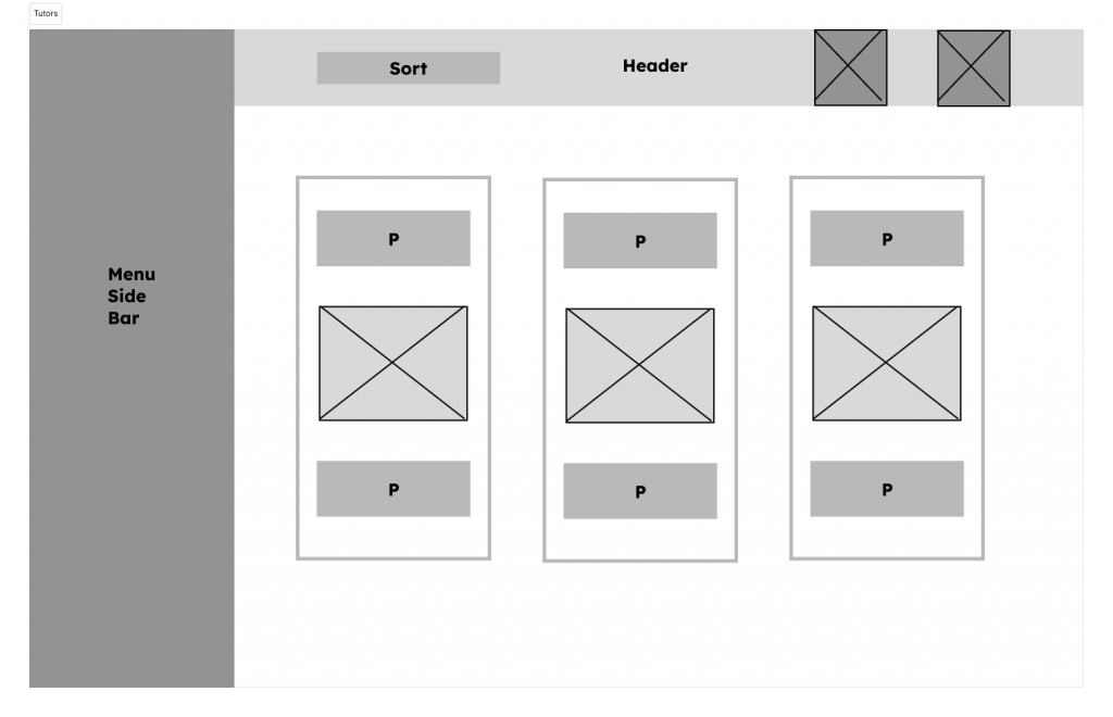
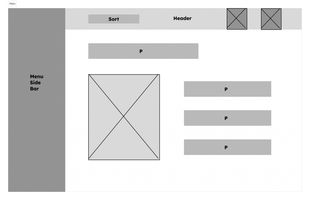
Mid-fidelity wireframing (Fig.18 -27) formalises the rough sketches usually in a software programme. This allows for more precise placing of design elements and allows stakeholders to visualise the design without the visual distraction of colour, images, text and sound. To view the mid-fidelity wireframe in app, please click on the link to Figma:


5.4.3 High Fidelity Mock Up and Prototype
The high fidelity mock up and prototype may be viewed on the Figma app (fig.28) below. Notes: Please select fit to screen option. Some CTA buttons show hover states, click surrounding images again to go through the Figma sequence. On the course page click on the science tab to access lesson. The lesson is 3 slides, click on the right hand planet to sequence, when finished click the cross button at top of page. Some pages have their own interactivity such as the tutor page and FAQ page.
Fig.28 High Fidelity Mock Up & Prototype (Heugh, 2024)
5.5 Testing
Testing in design is an iterative process rather than being an end consideration, through its formation and summation (Barnum, 2021). The earlier stage of the design process evaluates the user through the profile of market research, personas and empathy maps to ensure that the correct target audience is identified. Towards the end of the project, the designer strives to understand how the user interacts with the design through its prototype and mock up to assess whether the design has fulfilled its desired intention. The audience for accessibility is varied and it may not be possible to fulfil individual needs due to its complexity. Mahlke (2008) posits that users define their experiences through interactive system properties, user characteristics and context parameters, suggesting that it depends not only on the interactivity but the user and the context of the engagement. In the limited scope of this project, the testing is mapped against the International Standards Organisation (ISO) who define usability to the extent a product, system or service can be used by specified users to achieve effectiveness, efficiency and satisfaction in a specified context of use (ISO.org – 9241-11:2018).
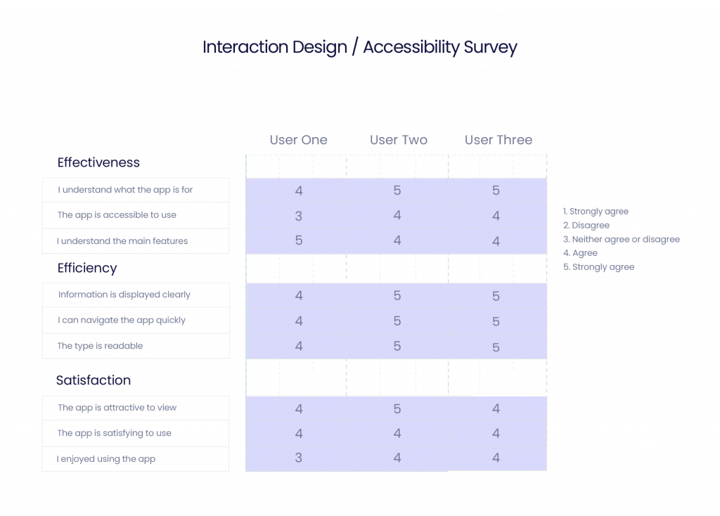
Three users were selected to trial the app of which one had trouble reading text on screen, so could assess the visual accessibility. User 1 scored 35, User 2 scored 41 and user 3 scored 40 out of a possible 45. The reasons why there were some lower scores may have had to do with the restrictions of a prototype as it is not exactly the same as using a fully functional app. However the scores were above average, which was promising. The user with visual issues used the browser settings to magnify but they did not have any issues with the colour contrast, which was interesting. The design aspects do not have to follow the text to background ratios of 4.5:1 (section 2.3). Overall the app design was received favourably with a mention regarding more interactivity in the space lesson to really bring it alive, such as clicking on individual planets which was noted and could be add if there were less time restriction.
6.0 Project Management
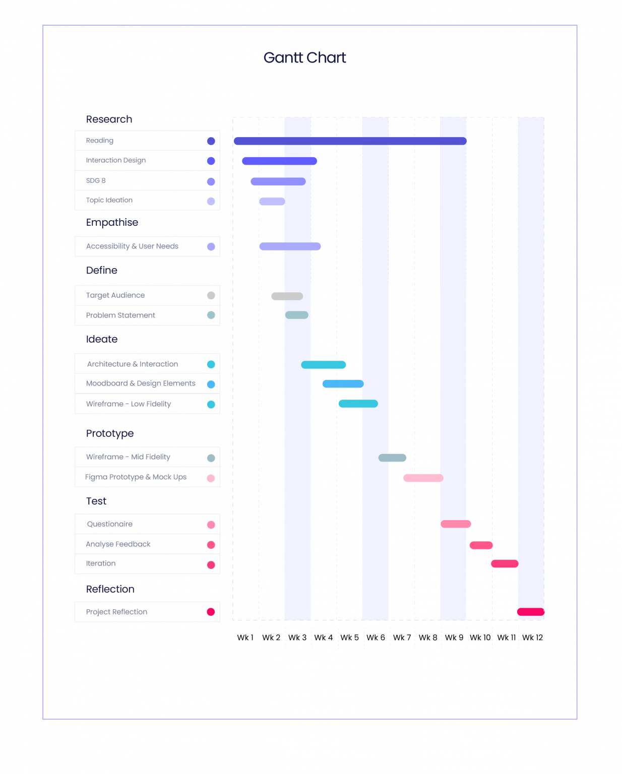
The project was managed over a 12 week period (Fig. 30). The overall style was hybrid with waterfall and sequential periods of agile management that concerned periods of design creativity.
8.0 Conclusion
The project revealed the complexities of accessibility and interaction design. It was realised that accessibility is not just a design problem but a social, technological and economic issue as well (section 2.1). However that does not mean that is to be ignored by the design profession who can educate their clients such as the business sector by informing of potential economic returns for including accessibility in their services. The designer also may feel they have to compromise artistic creativity to achieve this and the cost of quality contrast apps may inhibit some from attempting accessibility in designs, which is discussed in the reflective journal: https://designerdigital.uk/interaction-design-dm7906-reflective-journal/
References
Chang-Arana, Á.M. et al., (2020) Empathic Accuracy in Design: Exploring Design Outcomes Through Empathic Performance and Physiology. Design Science (6), p. e16.
Dalton, N (2013) Neurodiversity HCI. Available at: https://interactions.acm.org/archive/view/march-april-2013/neurodiversity-hci Accessed: 17.02.2024.
Davies, L (2018) Majority of Consumers Buying From Companies That Take A Stand on Issues They Care About and Ditching Those That Don’t, Accenture Study Finds. Available at: Majority of Consumers Buying From Companies That Take A Stand on Issues They Care About and Ditching Those That Don’t, Accenture Study Finds | Business Wire Accessed: 05.03.2024.
Donelly, C (2024) Neurodiversity is Often Given Less Priority Than other Areas of DE & I. Available at: https://diversity-network.com/why-neurodiversity-is-good-for-business/ Accessed: 18.02.2024.
Elm Learning (2024) What is Microlearning? Examples, Strategy and More. Available at: Microlearning: The Complete Guide to Strategy, Examples & More (elmlearning.com) Accessed: 10.04.24.
Fortune Business Insights (2024) Micro Learning Platform Market. Available at: Micro learning Platform Market Size, Industry Share | Forecast, 2032 (fortunebusinessinsights.com). Accessed: 16.04.2024
Gibbons, S (2016) Design Thinking 101. Available at: Design Thinking 101 (nngroup.com) Accessed: 17.04.2024.
Google Search Central (2024) Google Search Central. Available at: SEO Guide for Web Developers | Google Search Central | Documentation | Google for Developers Accessed: 05.03.2024.
Grimshaw, D. & Kühn, S. (2019) Sustainable Development Goal 8. World Employment and Social Outlook, 2019: pp. 57-72. Available at: https://doi.org/10.1002/wow3.152 Accessed: 17.02.2024.
Harris, G. B (2020) What New UK Web Accessibility Laws Mean For Public Sector Websites. Available at: https://business.scope.org.uk/article/what-new-uk-web-accessibility-laws-mean-for-public-sector-websites Accessed: 05.03.2024.
Hook, K. (2018) Designing With The Body In Mind. The MIT Press, 2018.
Interaction Design Foundation (2016a) Affordances – What Are Affordances? Available at: What are Affordances? | IxDF (interaction-design.org) Accessed: 05.04.2024.
Interaction Design Foundation (2016b) What is Skeuomorphism? Available at: What is skeuomorphism? — updated 2024 | IxDF (interaction-design.org) Accessed: 17.04.2024
Interaction Design Foundation (2016c) What is Wireframing? Interaction Design Foundation. Available at: What is Wireframing? — updated 2024 | IxDF (interaction-design.org). Accessed: 10.05.2024.
ITU (2024) Accessibility to ICTs. Available at: Accessibility to ICTs (itu.int) Accessed: 03.03.2024.
Kolb, D. A. (1984), Experiential Learning: Experience as the Source of Learning and Development. London, Prentice-Hall.
Krzeminska, A., Austin, R. D., Bruyere, S. M., Hedley, D (2019) The Advantages and Challenges of Neurodiversity Employment in Organisations. Journal of Management & Organization , Volume 25 , Special Issue 4: Neurodiversity , July 2019 , pp. 453 – 463.
Moggridge, B (2007) Designing Interactions, MIT Press, London, England.
Plattner (2007) Design Thinking – Hasso Plattner Institute (hpi.de).
Ramirez, J. D. (2023) The Future of EdTech: Key Trends Shaping The Landscape in 2023 and Beyond. Available at: The Future of EdTech: Key Trends Shaping the Landscape in 2023 and Beyond – EdTech Digest Accessed: 03.03.2024.
Roth, R (2021) 3 Key Elements For Great UX Design: Affordances, Signifiers, and Feedback. Available at: Affordances, Signifiers & Feedback: Definitions and Examples (careerfoundry.com) Accessed: 04.04.2024.
Siang (2021) What is Interation Design? Available at: What is Interaction Design? | IxDF (interaction-design.org) Accessed: 24.04.2024.
Soegaard, M. (2020) Hick’s Law: Making The Choice Easier For Users. Available at: Hick’s Law: Making the choice easier for users | IxDF (interaction-design.org) Accessed: 17.04.2024.
The Brain Charity (2024) Neurodivergent, Neurodiversity and Neurotypical: A Guide To The Terms. Available at: Neurodivergent, neurodiversity and neurotypical: a guide to the terms – The Brain Charity. Accessed: 16.04.2024.
UNRIC.org (2024) Regional Information Centre for Western Europe. Goal 8: Promote Inclusive and Sustainable Economic Growth, Employment and Decent Work For All. Available at: Sustainable Development Goals (SDG 8) | United Nations Western Europe (unric.org) Accessed: 16.02.2024
Wheelahan, L. and Moodie, G. (2021) Analysing Micro-Credentials in Higher Education: A Bernsteinian Analysis. Journal of Curriculum Studies, 53 (2), pp. 212–228.
Whitenton, K. (2013) Flat vs. Deep Website Hierarchies. Available at: Flat vs. Deep Website Hierarchies (nngroup.com) Accessed: 18.04.2024.
WHO (2024) Disability. Available at: Disability (who.int) Accessed: 05.03.2024.
Wojciechowski, J. (2023) The Impact of Skeuomorphic Design in Modern UI/UX. Available at: The Impact of Skeuomorphic Design in Modern UI/UX | by Jakub Wojciechowski | Medium Accessed: 17.04.2024.
Young, N (2024) Neurodiversity Learning. Available at: Navedia Young, Neurodiversity Learning The School for Social Entrepreneurs (the-sse.org) Accessed: 18.02.2024.
Bibliography
Hook, K. (2018) Designing With The Body In Mind. The MIT Press, 2018.
Shanley, C. (2016) Cracking Information Architecture. RS Books, 16 May 2016.