This week looks at the inspiration for creating the visual form of the app. Therefore the content, context and audience need to be taken into consideration.
Inspiration has been collated through a combination of resources – images, language and references to creative portfolios such as Adobe Behance.
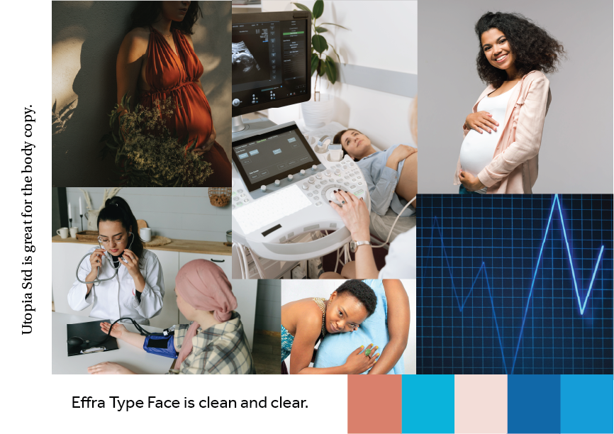
The mood board below reveals that pregnant women of all cultures are the target market. The colours were selected to be non-binary but still keeping a reference to the medical nature of this app. This is to reinforce the serious side but not to intimidate with the softer colours of brick and salmon. The type face is Effra for headings with Utopia Std for body copy, typefaces that are easy to read and non-ambiguous.
Mood Board - Heugh (2023)
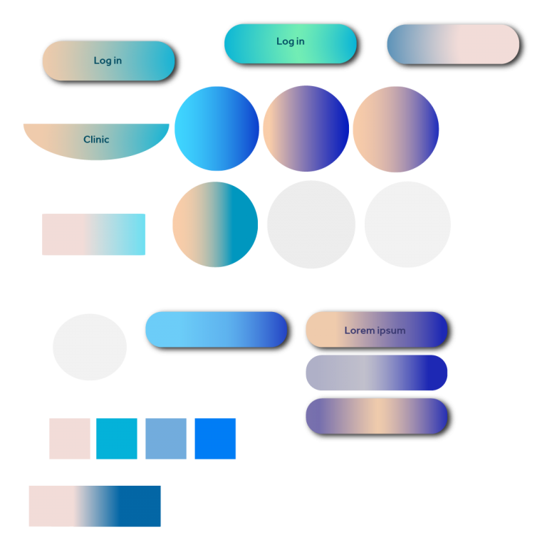
However, when developing gradients for the app (see gradient art board below), I found that the colours did not harmonise well. The brick colour was too close to red and its association with blood and trauma proved a negative selection. The salmon and turquoise was reminiscent of beach colours, so was deemed inappropriate. Blue and turquoise are often used in medical apps and look appealing, however blending the turquoise colour with a soft green and adding a dark green colour text (top middle) produced a calming feel, which is more desirable. A soft grey will complement the background giving a less stark feel than white. The mood board was revised (see below).
Gradient Art Board - Heugh (2023)
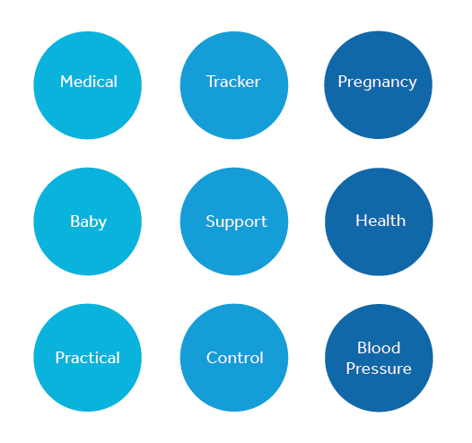
The next art board (see below) considers the words that may be used when considering pregnant women and the use of the app. Women want support through their journey and to feel they have some control in a perceivably unpredictable situation. The app therefore tends to play a largely functional role but provide an experience that is supportive and familiar and therefore shapes the app character.
App Language Identity - Heugh (2023)
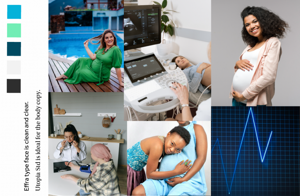
Revised Mood Board - Heugh (2023)
Familiarity can be depicted though the layout which is often used on using mobile apps but also through shapes. Pregnancy is associated with roundness and curves and has a softer profile than square or angular shapes. A rough sketch was produced to derive the logo and shapes. The logo pregnancy shape also resembles two birds in flight, which symbolise freedom and lack of stress.
The journal post next week looks at the wireframing process.