Emerging Media - RSA UX/UI Research

This post takes a deeper exploration into the pregnancy app market and the type of products available in the predominant app stores. Two apps have been selected and analysed to understand the user interface and experience of some of the more popular apps. The apps are What to Expect with 5m + views and Baby Centre with 10m + views selected from the Google Play Store (2023).
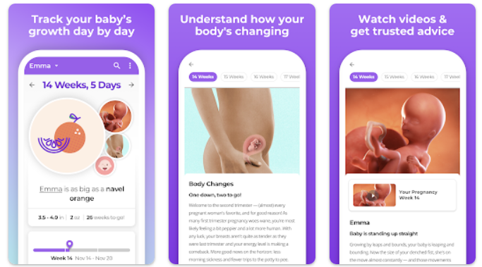
What to Expect
General Design Overview
Main Colours : Purple #9660EA | Green #73C3BS | Yellow #F9DE9F | Grey #6E3840
Type: Sans serif.
Layout: Two column.
Navigation: Footer with five top level pages.
Logo: Logo mark depicting pregnancy with heart.
Brand Personality: Friendly and cute. Commercial.
Navigation – The navigation links to five menu headers including:
- Today – which gives a daily account of the growth of the baby.
- Tools – provides more menu options.
- Registry – allows the user to subscribe to offers and free products.
- Community – allows the user to connect to a community group.
- Settings – provides information on data policies, use, terms and privacy.
Content – The app is predominantly a tracker where the user can gauge the milestones of their pregnancy and child’s post birth development. This personalised feature is based on either a due date or child’s birthday. The tracker shows expected pregnancy development and post birth allows tracking of feeds, nappy changes and sleep patterns. There are some other features such as an ovulation calculator, an optional community sign up and a registry, where users can apply for product offers and advice. The app developers monitor content with a What to Expect Medical Review Board to ensure content is evidence based and complies with accepted guidelines (What to Expect 2023). The settings page has a variety of information including conditions of app usage, data protection, FAQ’s and help information.
Reviews – The app has had more than 5m downloads and has a 4.8 star rating (Google Play Store, 2023). The app was commended on ease of use, information and tracking functionality. Negative comments concerned technical issues such as sign up and connectivity issues.
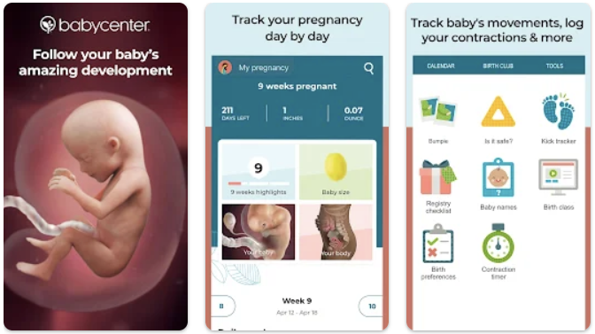
Baby Centre
General Design Overview
Main Colours: Teal #3B8096 | Orange #EF9181 | White #FFFFFF
Maroon #6E3840
Type: Sans Serif.
Layout: Two Column.
Navigation: Footer with four top level pages.
Logo: Logo mark depicting germinating plant.
Brand personality: Informative and realistic.
Navigation – The navigation links to four menu headers including:
- Home – Selection of reading materials, development video and bump photo gallery.
- Birth Club – Online community
- Tools – Sub menu for pregnancy, baby and trying to conceive.
- More – List of information regarding profile, settings, FAQ’s etc.
Content – This app offers detailed week by week foetal development with images and videos. A personalised calendar can be set up for your baby, it also contains a photo organiser. The health information is overseen by the Baby Centre Medical Advisory Board and registered with the Patient Information Forum (PIF), Baby Centre, (2023). There is also information on birthing decisions and a baby name finder as well as a community forum. The More page provides a comprehensive list of user information and help.
Reviews – The app has had more than 10m downloads and a 4.8 star rating (Google Play Store, 2023). The app was commended on its resources, week by week tracker and updates with informative advice in one place. Negative comments concerned navigation issues on community page that meant excessive scrolling, the tracker not being mindful of baby loss and a lack of articles.
The next journal post will look into design options and inspiration for the RSA app project.
References
Baby Centre (2023), About BabyCenter – BabyCentre UK – Accessed: 27.07.2023.
Google Play Store (2023), pregnancy apps – Android Apps on Google Play – Accessed: 26.07.2023.
What to Expect (2023), Pregnancy Apps from What to Expect – Best Pregnancy Tracker App – Accessed: 26.07.2023.